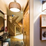
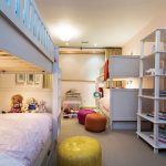
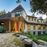
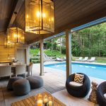
Designer Kimberley Seldon transforms a country house south of Creemore from merely great to downright stunning.
by Judy Ross
photography by Derek Trask
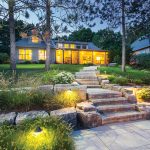
The house settles into the folds of the land at the end of a long, curving driveway. Tall trees surround it, forming a leafy canopy that can be seen from every window. Once inside, it feels organic and relaxed – peaceful, even though it is a weekend home to a family with four young children (two sets of twins).
It was the prospect of the second set of twins that prompted Jim and Maricke Emanoilidis to “have the conversation” about what their weekend life would be like in the city with four kids.
“We envisioned our days spent driving to hockey practices and ballet lessons, and that’s not what we wanted,” says Maricke. “We decided then to look for a house in the country where we could all escape and be together on weekends.”
Their search ended when they found this property south of Creemore, which features a custom three-storey home set amongst 67 acres of woods with a creek meandering through it. They fell in love immediately. The house, with its open, airy rooms and a lower level with plenty of kid-friendly space, was perfect for their family. And, as an added bonus, the owner was willing to sell most of the furniture, which the Emanoilidises presumed would make their move so much easier. It wasn’t until after taking possession that they realized there’s much more to the look of a house than furniture. All the carpets, lamps and art had been taken away; as Maricke says, “all the stuff that gives it life!”
With no time to find the “stuff” herself, Maricke contacted Kimberley Seldon, the superstar Toronto designer who also has a country home in the area. Seldon toured the house, interviewed the couple about their lifestyle, took photos and measurements, then went away for two months to pull her vision together.
Her only directive from Maricke and Jim was that they wanted something a little more contemporary, but they didn’t want a ‘don’t touch’ kind of house.
“When you start with a beautiful property like this,” explains Seldon, “you don’t want to detract from the setting or the architecture. Basically my job is to not mess it up.”
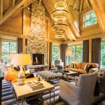
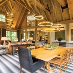
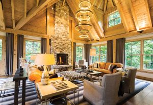
No structural changes were made, although some of the interior pine cabinetry was painted out to elevate the country look and make it more polished. A few walls had to be opened up to install new light fixtures – a key consideration in the overall design. The most dramatic of these new fixtures are the two contemporary chandeliers that hang like orbiting planets in the large open living space. Consisting of brass-toned rings that descend from the high ceiling, they were hand-made and shipped from Italy. The chandeliers, according to Maricke, were a very “big splurge,” which she and Jim justified by calling them illuminated art.
Seldon agrees that the light fixtures act as large pieces of artwork, but they’re also practical, adding LED lighting (both up and down lights) in what could feel like a cavernous space.
“A two-storey height is not comfortable psychologically for humans,” she offers. “You need a big feature overhead to fill it up and make it feel warmer. The circular shapes also help to soften the hard edges of the architecture.”
The couple still remembers the spring day six months after that first meeting with Seldon, when she greeted them on the front porch for the ‘big reveal.’ From the foyer on into the main floor, everything had changed as though a magic wand had been passed over the entire space. In the living area the two oversized leather couches remained, but there were new chairs, carpet, lamps, tables, a Kilim ottoman, toss blankets and cushions, and interesting art pieces like the wooden stool encased in a block of resin that attracts attention on the coffee table.
Seldon also placed both an ottoman and a coffee table between the two living room sofas – “one coffee table is often not enough in a large room,” she maintains – and added four end tables as well as consoles behind the sofas to frame the living space in the open room.
“It just all worked together,” enthuses Maricke, “and it was something that I would have no vision, or time, to do on my own.”
After decades as a designer and business owner, Seldon sees people making the same mistakes over and over. “Clients often think they only need a few things to finish off the interior space, but it’s always more complex than that,” she notes.
For instance, the dining table and wooden chairs purchased from the former owner were well suited to the space, but Seldon added two black armchairs for the ends of the table. “And that,” she says, “made a big difference,” anchoring the table and making a bolder statement.
The massive stone fireplace was impressive, but needed to be more of a feature, so Seldon found two matching white credenzas to flank both sides. “They add needed storage but more importantly, they make a statement out of the fireplace,” she says. “People underestimate what is required to fill a big space.”
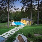
Although the property had already been beautifully landscaped, the Emanoilidises wanted to put in a swimming pool, so Seldon came up with a design that would make the pool area like a resort, complete with an outdoor kitchen, living and dining space. Two cabanas – one with a bedroom and one with a bath/changing room – are connected by a covered, high-ceilinged space that opens to the pool, where the family can gather around the fireplace, watch TV and have meals all summer long.
The poolside bedroom is often used as a guest suite. “With Kimberley’s help we have really created a weekend party house,” says Maricke. “It works perfectly because with four kids, we don’t get a lot of invitations. We have people come to us.”
The success of any design project comes down to how the family enjoys living in the space, and how the design choices have endured. Maricke laughs when she thinks of it. “I didn’t change a thing after Kimberley staged the house for our ‘reveal.’ The living room is exactly as she arranged it. Even the throw blankets on the chairs are in the exact same place.”
And what designer wouldn’t be happy with that? ❧
Source Guide
EXTERIOR
- Pool installation and Hardscape – Betz Pools, Stouffville
- Cabana Design – Kimberley Seldon Design Group, Toronto
- Cabana Construction – Heinz Prachter Landscape Designers and Contractors, Stouffville
- Landscape Lighting and Gardens – Hill’N Dale Landscaping, Mulmur
LIVING ROOM
- Side Tables – Elte, Toronto
- Round Table – South Hill Home, Toronto
- Drapes – Studio La Beaute, Toronto (Fabric: Kravet)
- Armchairs – Custom, Kimberley Seldon Design Group, Toronto
- Coffee Table – High Point Market, North Carolina
- Ottoman – Moyaboya, Creemore (since closed)
- Carpet – Weavers Art, Toronto
- Italian Chandeliers – Avenue Road, Toronto
DINING ROOM
- Black Chairs – Custom, Kimberley Seldon Design Group, Toronto
- Custom Painting of Sideboard – Halstead and Company, Hornings Mills
- Paintings Over Sideboard – North Carolina Art Crawl
- Circle Sculptures on Sideboard – North Carolina Art Crawl
KITCHEN
- Bar Stools – Mark Albrecht Studio, New York
- Pendant Lights – Hollace Cluny, Toronto
HALLWAY
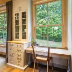
- Desk Chair – Hollace Cluny, Toronto
- E Sign on Photo Wall – Spruce, Toronto
- Feather Prints on Stairway Wall – Natural Curiosities (to the trade)
- Shadow Boxes with Wire Art – Avenue Road, Toronto
- Light Fixtures – Sescolite, Toronto
SCREEN PORCH
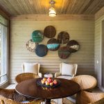
- Oil Tin Wall Art – North Carolina Art Crawl
POOL CABANA
- Pendant Lights – Sescolite, Toronto
- Furniture – Restoration Hardware, Toronto


