A major reno and addition transformed this country cabin from a rustic weekend getaway to a stunning full-time home
by Cecily Ross, photography by Derek Trask
Julie and Roy Suarez’s Singhampton country house isn’t what it used to be. Not that you’d notice as you drive up their winding laneway. Because from the outside, little about the modest cedar-clad house the couple purchased 15 years ago appears to have changed.
Nestled on five wooded acres, its dimensions look as unassuming as ever. But step inside and instead of a comfortable cabin in the woods, you enter a spacious family home, much grander than you would ever have imagined.
The illusion is deliberate. The Suarezes knew when they bought the house that someday they would make it their permanent home. And that day has come. With their son and daughter away at school in the United States, Julie and Roy recently downsized to a small condominium in Toronto where Roy still has his dental practice. But for all intents and purposes, what was once a weekend getaway is now their primary residence.
Before that change could take place, however, the couple needed to make some changes. They asked architectural designer Jim Campbell of Rockside Campbell Design in Duntroon to turn their house into a home without compromising its scale or character.
The Suarezes wanted to significantly increase their living space by adding a sunroom, a new kitchen and great room to the existing 2,000-square-foot, three-bedroom (plus one), storey-and-a-half structure.
The challenges were significant, says Campbell. For one thing, the land the house sits on is very wet, which limited where an addition could be built. Then there was the problem of how to blend the new with the old.
“With a house like this,” says Campbell, “you can’t really have a starkly contrasting addition the way you might with a Victorian farmhouse. A blatantly modernist addition would not have worked; there’s not enough contrast. We decided it would be best to carry on with a version of the existing house.”
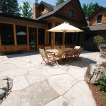
To that end, Campbell and the builder, Richard Talbot of Creemore, covered the 1,000-square-foot addition with the same cedar shakes as the rest of the house. And because the new wing has been added at the rear of the building, it is nearly invisible from the front.
“From the outside you would have no idea of the expansive interior that has made a huge difference in terms of liveability,” says Campbell.
He also had to figure out how to make a visually seamless interior transition from the cosy eight-foot ceilings of the existing living room and dining room to the vaulted barn-like openness of the new space.
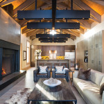
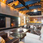
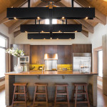
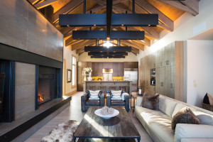
The beating heart of the house is now the airy great room and open kitchen with cathedral-like ceilings. Large criss-crossed beams suspended like medieval sculptures above the seating and cooking areas reduce the scale of the room without compromising its expansiveness. Julie saw something similar in a design magazine, and Campbell had Talbot, who is an accomplished carpenter, build them from scratch. The structures, which double as giant light fixtures with halogen lights nestled at the intersection of each cross piece, have the substantial appearance of iron eyebeams. In fact, Richard made them from MDF painted black.
The beams also echo the steel-plated channels embedded in the fireplace wall. This massive wall clad in limestone tiles contains a large wood-burning hearth on one side, with a “guillotine door” – a chain link screen that pulls down or, alternatively, a sliding glass cover for a more energy-efficient burn. On the left side, almost mirroring the hearth, is an oversized television set. South-facing windows let lots of light into the cave-like space.
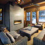
The wall gives a sense of organization to the interior of the house, balancing the view from the dining room and anchoring the living areas. It acts as a foil for the large sunroom on the other side. Moving from the womb-like protected atmosphere of the great room into the bright, glassed-in sunroom behind it, with its panoramic views of the surrounding farmer’s field, is a “like a revelation,” says Campbell. The sunroom, with its banks of windows on three sides and its limestone tile gas fireplace, is an all-season space that both protects and exposes by breaking down the boundaries between indoors and out.
The sunroom’s interior walls feature the same cedar shakes as the home’s exterior. The ceiling and beams are rough-sawn pine. Radiant heating keeps the sunroom floors, which are concrete dyed black, nice and warm.
For the floors in the rest of the house, Julie chose a wood-grained porcelain floor tile from Tunisia instead of traditional hardwood.
She opted for the tile because it is indestructible, impervious to dogs and bicycle cleats and ski boots. “We just thought it would be more practical than hardwood.”
“I was skeptical at first,” says Campbell, “but then I saw them. They are exceptionally realistic.”
The kitchen, too, with its straightforward island design, is as functional as it is handsome. The cupboards, custom-made by Talbot, are Douglas fir stained a rich dark brown. The counters are a contrasting taupe Caesarstone. Julie claims not to be a cook. “Roy is the chef in the family,” she says of her husband, who is aided no doubt by the six-burner Wolf stove, an oversized Sub-Zero fridge and dual electric ovens. Flanking the kitchen and linking it to the great room is a large pantry wall with ample storage space and an impressive 400-bottle, temperature-controlled wine refrigerator.
In order to maintain a sense of unity between the original rooms and the new space, Julie has carried the same neutral colour palette throughout. She calls the subtly contrasting shades of taupes, grey/browns and beiges “earth tone,” explaining, “It’s very calming. I love bold colours, but I don’t want them everywhere.”
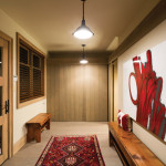
To provide hits of colour, she has injected an occasional bright red punch in her choices of artwork, rugs and throw pillows scattered around the house. The furniture, lamps and other decorative touches are almost all from Restoration Hardware, adding once again to the overall cohesion of the interior.
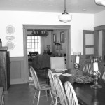
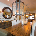
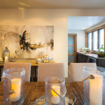
The new dining room is now located in the centre of the house. It boasts a rustic trestle table, comfy chairs and chunky iron lanterns that tie in with the great room’s black accents. Off the dining room, what used to be a small galley kitchen now serves as a wet bar with a walkout to the swimming pool area. Beyond that Julie added a powder room and a laundry room.
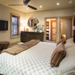
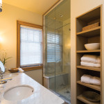
One thing that always bothered Julie about the old configuration was the location of the master bedroom directly off the dining room. “You’d be sitting at the table looking right into our personal space,” she says. Campbell solved the problem by creating a small foyer entrance into the completely redecorated bedroom, which boasts more of Richard Talbot’s handiwork: custom-crafted Douglas fir closets, headboard and dressers. The adjoining master bathroom features marble counters and a walk-in steam shower. A separate water closet houses the toilet.
The former living room is now a den with a wood-burning fieldstone fireplace and wide windows overlooking the tennis court. It has two adjoining bedrooms and a shared bathroom. Because the area can be closed off with glass-panelled pocket doors, it affords privacy for guests or the Suarez’s son and daughter when they come home for the weekends.
“We don’t have a Muskoka cottage,” says Julie, “so this has been our year-round recreational property.” But with the help of Jim Campbell and his crew, the Suarezes have transformed it into much more than that.
“When we bought this house, we knew one day it would be our permanent home,” says Julie. And as the Suarezes settle into full-time country living, their one-time home-away-from-home is now simply home sweet home. ❧


