Art advisor Manny Neubacher explains the finer points of filling your home with artwork—an art in and of itself.
by Anya Shor // photography By Anya Shor // shot on location at JS Design House
When artist, gallerist, art advisor and stylist Manny Neubacher curates a home, he thinks of it like planning the perfect dinner party.
“The ideal gathering would involve a diverse assembly of guests, each one bringing a unique perspective to the conversation but with one common thread throughout to create a starting point,” Neubacher muses. “Thoughtful placement, like a good seating plan, will ensure these conversations can flow seamlessly throughout the house, from room to room.”
Neubacher launched an art placement and consultancy service to address a noticeable gap between how people appreciate art in a gallery and their ability to visualize it in their home.
“They might not trust their own judgement,” he explains. “Or they worry what others will think. Or they don’t know where to hang a piece and how it would relate to other pieces. Not understanding how art works with the design and decor of the home can also be a stumbling block.”
Neubacher works to break down and dispel some of the conventional ideas about living with art and helps people navigate the process from searching and falling in love with a piece, to transporting it home, placing it thoughtfully, and making sure it is properly framed and hung.
He also believes that art should be an integral part of the initial home design, not an afterthought. “Ideally, the art would be taken into account during the process of placing and selecting furniture pieces for a home. Sometimes a large wall simply needs a stunning artwork and nothing else around it, instead of another bench or console,” he says.
Neubacher believes art can be the most impactful element in a space, not only defining the character of the room, but of the homeowner as well.
“Just changing the art and allowing the other details in the room to correspond accordingly can create a completely different picture of what kind of person the homeowner might be.” He suggests having fun with it. “The art in a home shouldn’t have to be boring or take itself too seriously. Art can be humorous, provocative, sublime. Look for unusual palettes, shapes, and subject matter. Hang photography next to oil paintings, hang work in unexpected places. The unexpected is charming.”
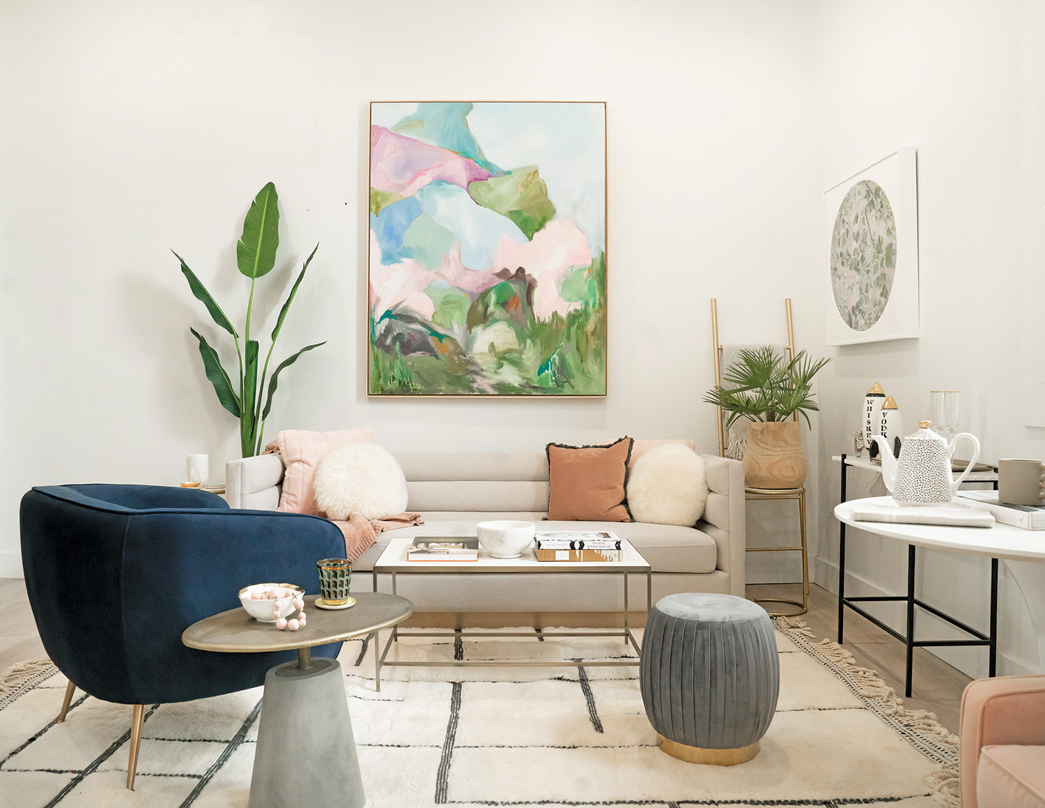
The Classic
Main wall Large vertical abstract Kara Mcintosh
Right wall Circular collage Becky Comber
The traditional approach to choosing an artwork over the sofa is to go with a medium to large landscape or abstract. But even this option can be treated in an unexpected way.
“Don’t be afraid to go vertical over a sofa, especially if you have the ceiling height,” says art advisor Manny Neubacher. “It will allow the eye to move up and down, making the ceiling height seem taller.”
Choosing a complementary piece in a different medium—a photograph or work on paper—creates an interesting conversation between walls.
“It’s nice to mix mediums and these two pieces work very well together. A beautifully painted abstract landscape is paired nicely with a photo collage with a natural element. The larger vertical piece is balanced by the smaller square piece.”
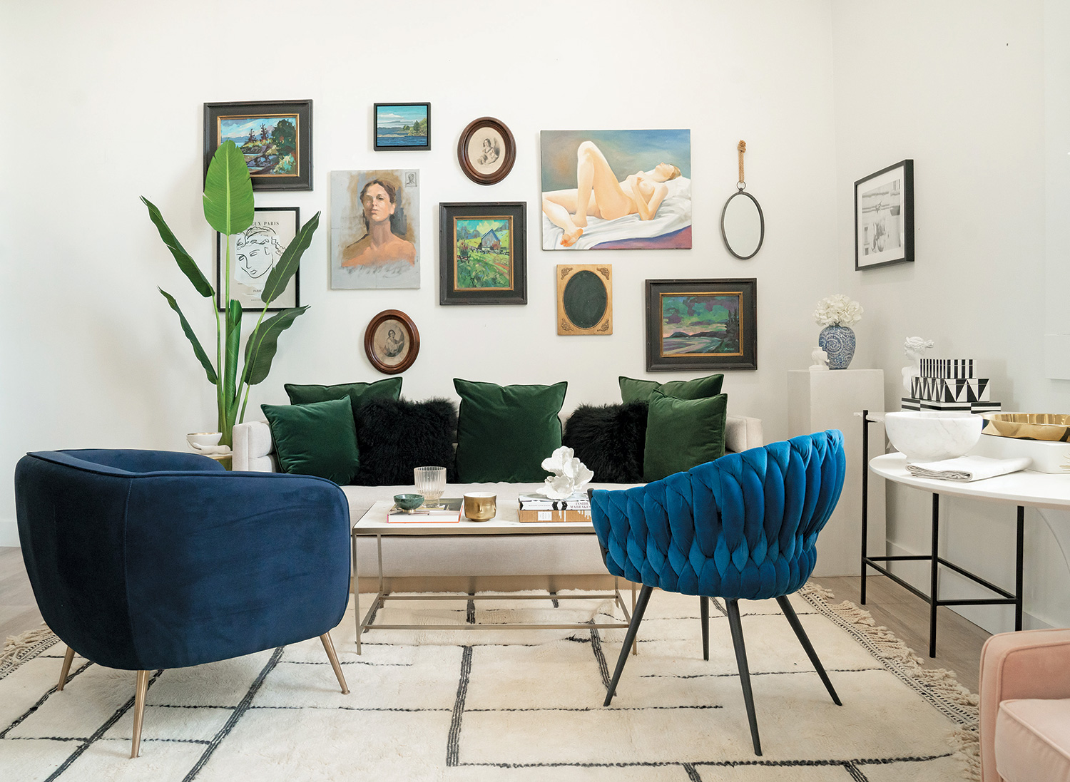
The Salon
Main Wall
Nude reclining Jon Houghton
Portrait Andrew Peycha
Three black-framed landscapes Brian Buckrell
Small landscape Rob Saley
Black and white portrait sketch JS Design House
Oval cameos and mirrors Art Stylists
Right wall
Black and white shot of sculpture
JS Design House
The gallery wall is a popular way to fill a large space that can be very personal, eclectic and sometimes the most affordable. It can be a combination of mediums—objects, antique finds, posters, paintings, drawings or photography.
Neubacher explains, “When I curate a salon wall, I like to start with the hero piece and work out from that starting point, weighing each piece carefully as I go along, paying attention to the way the images play off each other in theme and colour as well as in shape. There is so much room to play—with the distance between pieces or creating some sort of orderly pattern with the shapes, whether it’s a linear grid hang where everything is equal distance or a less formal layout allowing for subtle variations to create a specific overall effect.” There’s no one right way and it doesn’t have to be permanent. One can opt to have all the frames be of the same colour, or choose complementary tones. Personal drawings and photos can be tacked right onto the wall or curious objects can be suspended from antique hooks. It should be creatively liberating and ever-changing.
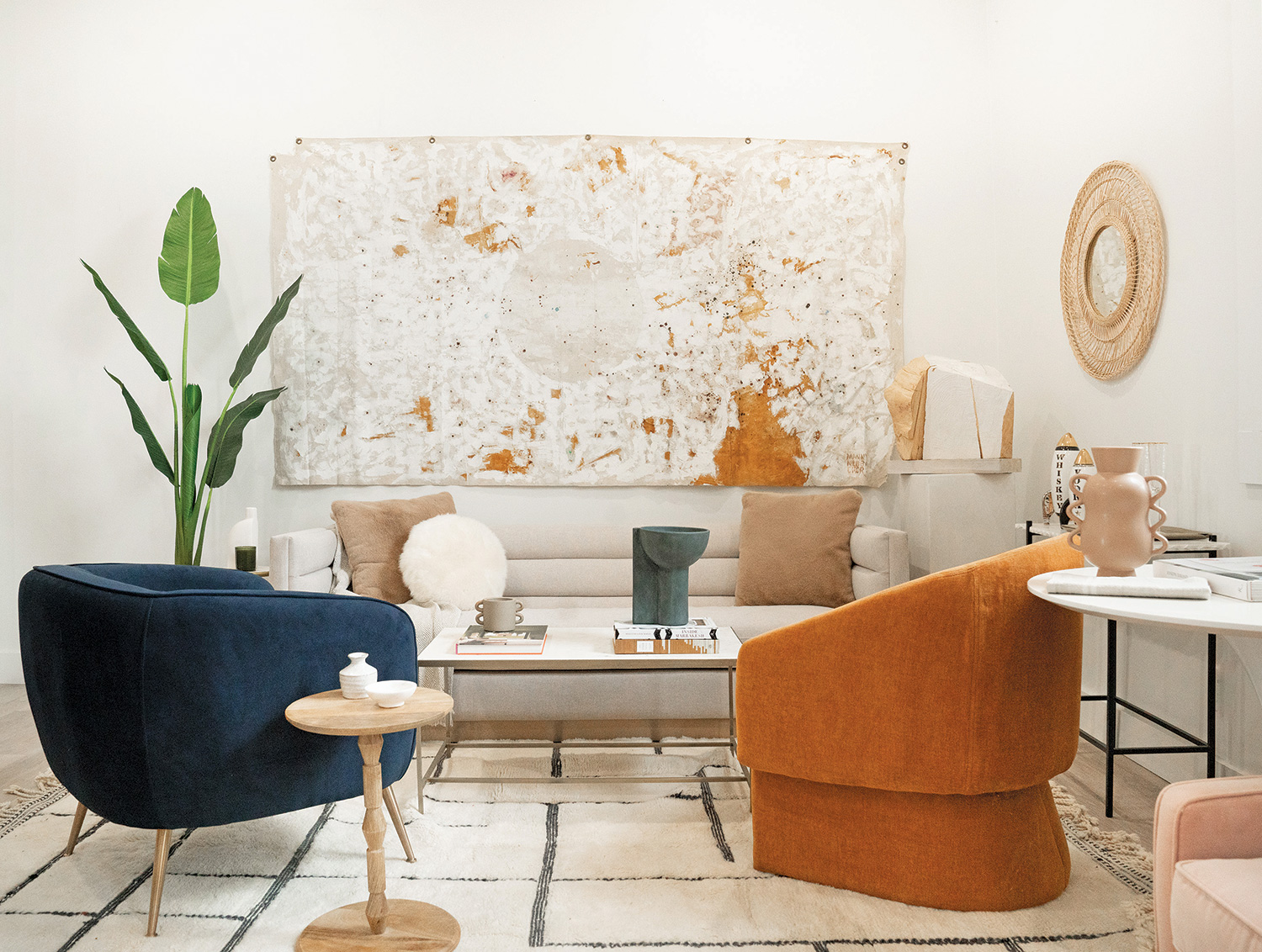
The Bohemian
Main wall
Large abstract Manny Neubacher
Wood sculpture on pedestal Manny Neubacher
Oversized works might seem unnecessarily daunting. If you have a large wall to fill or like the look of tapestry, consider treating an unframed canvas the same way. The trick is to choose a piece that feels organic and textural. “A very natural, unframed, floating abstract in neutral tones acts like a tapestry, adding an airy quality to the room, paired here with a large sculptural piece which reinforces the natural feeling of the painting, creating a layer of sophistication,” says Neubacher.
Look for sculptural accessories in organic materials, like raw-edged wood, rattan and wool to complete the overall natural feeling. “To the right of the abstract, the round rattan mirror is a nice touch. The circular form is repeated, mirroring the large abstract. This interesting grouping finishes off the two walls and corner perfectly.”
Hanging tips
Neubacher is adamant that artwork be hung properly: “The first thing I notice in a home, or even an art gallery, is how the artwork is hung. It can be very distracting if it’s not done well.” If it’s within your budget, a professional art hanger is preferred, but depending on the number of pieces, the hourly cost can really add up. Here are some helpful tips from the master art hanger himself to get you started.
Find your center
“Museums like to hang works somewhere in between 56 to 60 inches from the floor to the centre of the piece, taking into account the average height of viewers. I like to hang at 58 inches wherever possible but understanding there are often obstacles or other features in a home which have to be taken into consideration, like fireplaces, couches, bed frames and window height, for example. I find if the majority of the pieces are hung with the same centre height there is a nice flow between pieces even if they are different sizes.”
Frame it up
“I prefer to frame paintings, especially abstracts, in simple profiles, to give it polish without distracting from the work. Natural, neutral, white, black or colourful all work depending on the tone of the piece. Like picking out a pair of shoes, it should complement the outfit. Consider the wood tones in the design of the house so it doesn’t fight with the other elements in the room. Avoid double or triple mats, which can feel dated. Choose clean lines to access the image. The frame can be cut close to the image, or a larger back mat can be used to offer breathing room around the piece if required and for added dimensional interest. I prefer white tones as opposed to coloured back mats.”
Don’t forget your sunscreen
“If it’s a valuable piece and hung close to a window, I recommend museum glass—99 percent UV-protective with minimal reflection. Although it can be very cost-prohibitive, it’s the best way to view the piece and protect it against light damage. A very good, slightly less expensive product is UltraVue or Tru Vue. It’s a beautiful glass which offers minimal reflection and a UV protection of 70 percent—slightly less than museum-quality, but still much better than conventional glass. This is the glass I use most often. It is still best not to hang fragile paperwork and photography in areas with a lot of direct sunlight to avoid fading over time.”


