This unique home combines modern design with rustic elements for a thoroughly modern take on chalet style
story by Judy Ross, photography by Derek Trask
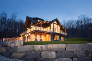
For Anita Lauer a house is more than a home. It’s a project; an undertaking that involves a multitude of skills, a strong sense of design, and a willingness to spend months building the ultimate dream home, live in it for a while, and then move on. She and her late husband Colin Huismans had just sold their last custom home near Creemore when they bought this hillside property a few years ago. The existing shabby chalet, which had been there since the 1950s, provided a place to live and allowed them to become familiar with the lay of the land as they began the design process. Once the site was cleared and the driveway rerouted they started building, incorporating the most up-to-date technology and the finest of materials and fixtures.
Last winter, when the house was nearing completion, Colin died suddenly, leaving Anita to finish what they had begun together. “We worked well as a team,” she says sadly, “so it’s hard, but I knew what he wanted done with the final details and that makes it easier to carry on.”
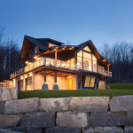
The process is what she loves. The last house the couple built was timber frame and completely different from this contemporary home with sweeping views. “We approach the building project pragmatically,” says Anita, “by first asking ‘what is this piece of land saying needs to be here?’ The beauty of this site is that the house was able to be both ‘perched and nestled.’” As she points out, it is hard to find a house that backs into a treed hillside so it is protected but is still open to great views of the landscape.
The five-bedroom, five-bathroom house is located near Osler Bluffs and perfect for a family of skiers, but avoids the ubiquitous mountain chalet look. As a real estate agent, Anita sees a great deal of sameness in building styles and admits it can be hard to break away from what you see all the time. She and Colin believed that styles don’t last forever, and they wanted to make this house both liveable and unique, with an energy-efficient, forward-looking design, even though it cost more to build this way.
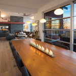
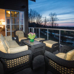
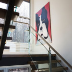
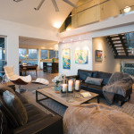
The first design decision was to maximize the views. The house is 48 per cent glass – more than the new building code allotment of 21 per cent. In order to use more glass and still meet code requirements, they added extra insulation, put in ICF (insulated concrete forms) foundation, increased the window glass insulation, and installed a dual heating system of forced air and radiant heating. By treating the interior like a clean-lined contemporary envelope, they kept the views a priority. They chose a neutral palette of white, light grey and dark grey, selected unobtrusive commercial-grade windows made of anodized aluminum, and put in drywall returns instead of trim on doors and windows.
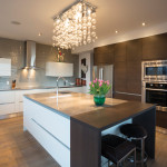
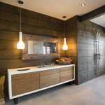
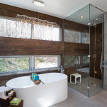
“We build to sell,” notes Anita, whose background is in graphic design, “but we want it great.” As she points out, innovations in interior design usually appear first in commercial installations, so Anita uses her commercial design connections to get a sneak preview and purchase some of the most up-to-date products. Her master bathroom – her “favorite room in the house” – is a showcase for some of these ‘of-the-moment’ goods and materials. The flooring consists of larger than average 2-foot by 4-foot porcelain tiles. And the walls, another ‘on trend’ look, appear to be wood planks but are actually porcelain tile. The milky white vessel sinks, like pieces of sculpture, have hidden drains and are made from a solid surface material that feels like honed marble.
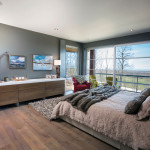
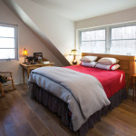
The finishes for a house always start with one thing, according to Anita. In this case it was the flooring. To offset the modernity of the house they chose ‘fumed’ oak floors, which have a smoky-toned look with a rough-grain texture that never scratches and provides a warming element to the interior. These factory-finished floors were laid all through the living area, the master bedroom and the second floor. “I like continuity in a house,” says Anita, “so we used the same materials, the same flooring and porcelain wall tile throughout.”
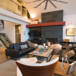
One of the most telling features in creative custom homes is wildly inventive light fixtures. “We look everywhere for lighting,” notes Anita, who worked with six different lighting stores to buy the distinctive fixtures which dazzle like pieces of handcrafted jewelry throughout the house. To avoid a clichéd look, Anita and Colin chose not to put a huge chandelier in the lofty great room, but the height of the ceiling called for something so instead of a chandelier, “we put in a big-ass fan.”
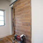
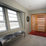
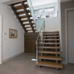
Scale, proportion and volume are always top-of-mind during a design/build and Anita believes the entrance hall (or gear room) where people enter the home is important because it sets the stage for what is to come. In this house the main living space is on the second level but the ground level entrance is vast, with 10-foot ceilings, heated oversize tile floors, and walls of wood and square-cut stone that echo the architectural style. A bank of wooden cabinets (with old skis mounted as handles) are practical requirements for active families with tons of outdoor gear.
For Anita, the house has been a major project, one that consumed a great deal of thought, care and hard work. But she points out that so much of the success depended on Colin’s “sense of design and incredible ability to see details.” She is comforted by the fact that she and Colin built up a roster of amazing tradespeople over the years, who will continue to work with her as she moves forward, always ready and intrigued by the challenge of the next new project. ❧


