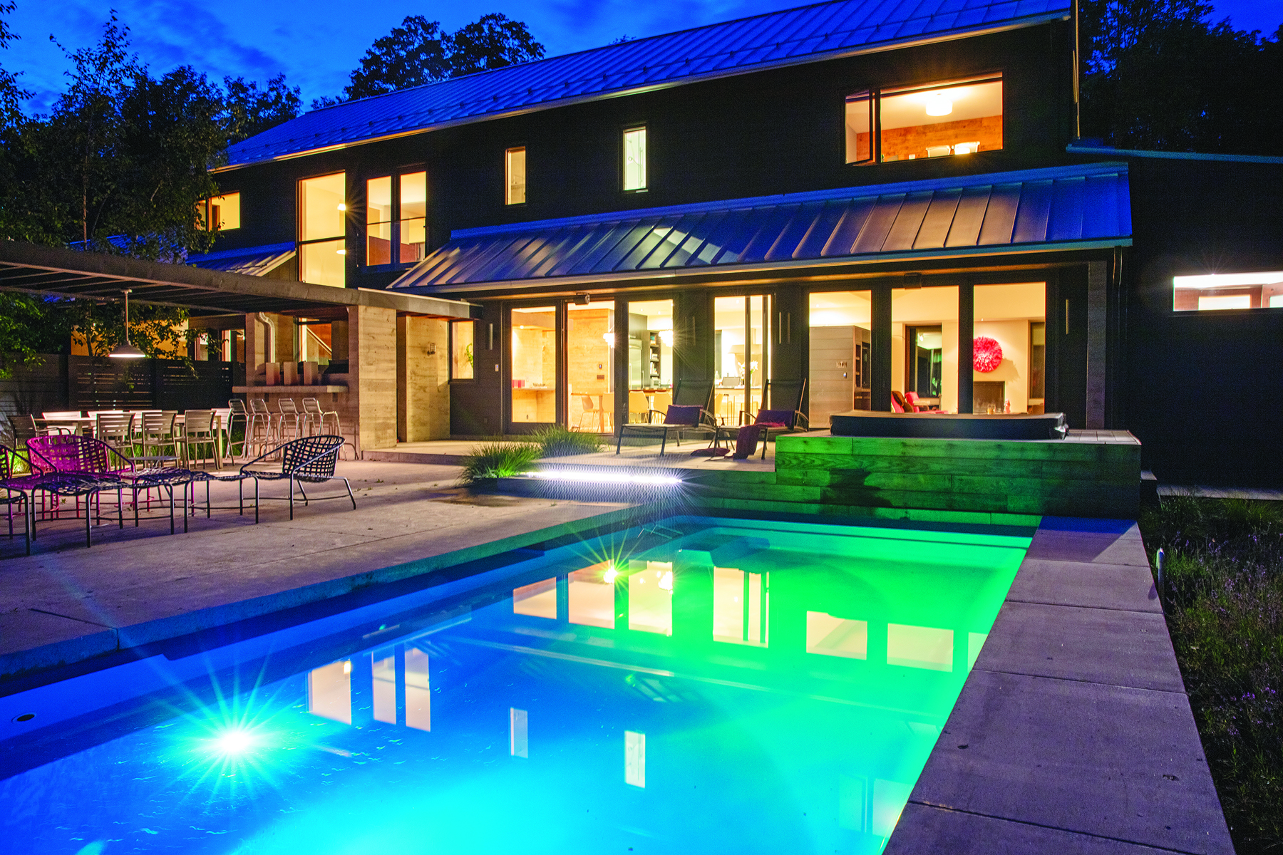
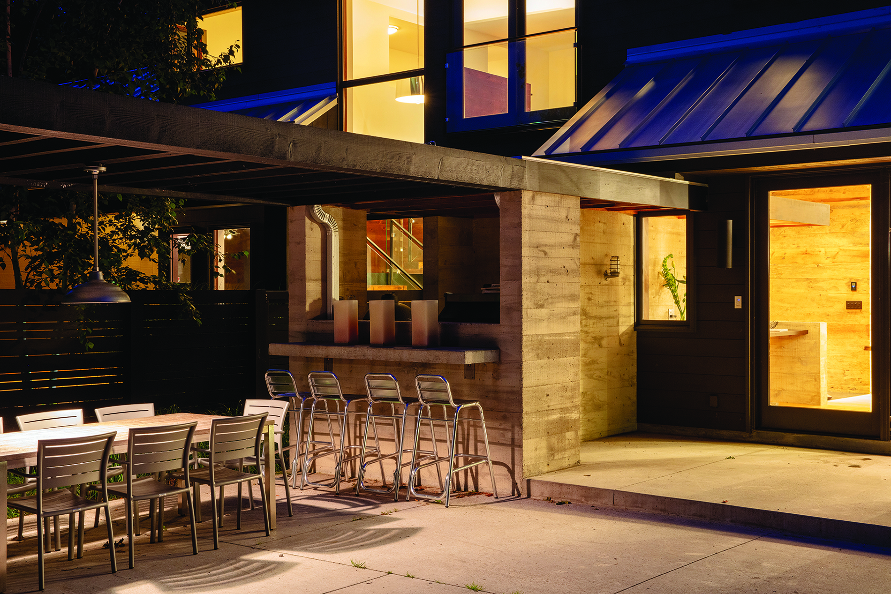
This contemporary Meaford home uses natural light and a balance between farm and forest views to create a sophisticated yet calming oasis
by Janet Lees, photography by Lorne Bridgman
When Helen and Chris Thomson decided to build a custom home, they knew they didn’t want a water view. “With a water view you’re facing north, so you walk into your house on a sunny day and it’s so dark inside that your eyes have to adjust; it makes your house dark when it’s beautiful outside,” says Helen. It can also be difficult to balance the heat in a north-facing home because the western side can get very hot.
So instead, the Thomsons opted for a south-facing home on the edge of a ravine in Meaford, with vistas of farmland on one side and forest on the other. Working with architectural designer Jim Campbell of Rockside Campbell Design and builder Frank Wyssen of Creek Valley Inc., the Thomsons created a modern home that uses light, views and energy-efficiency in all the right ways.
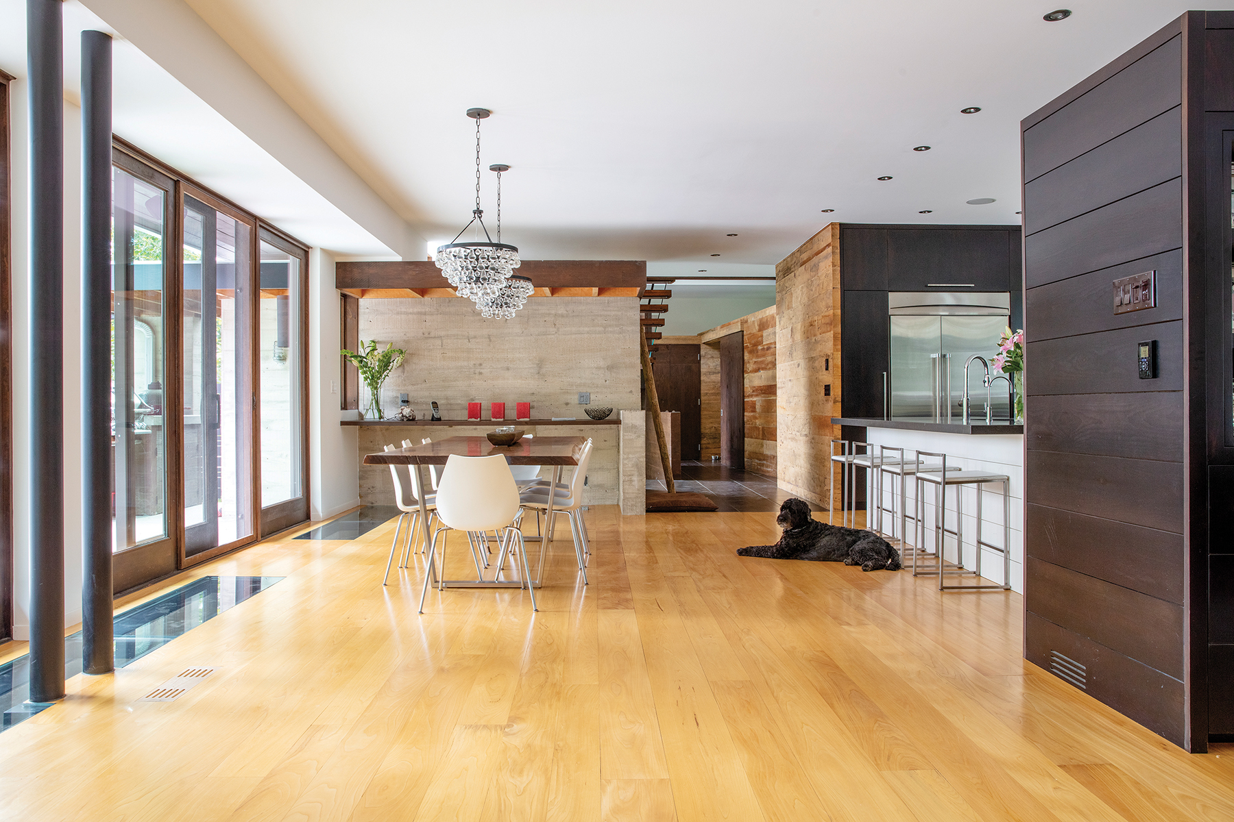
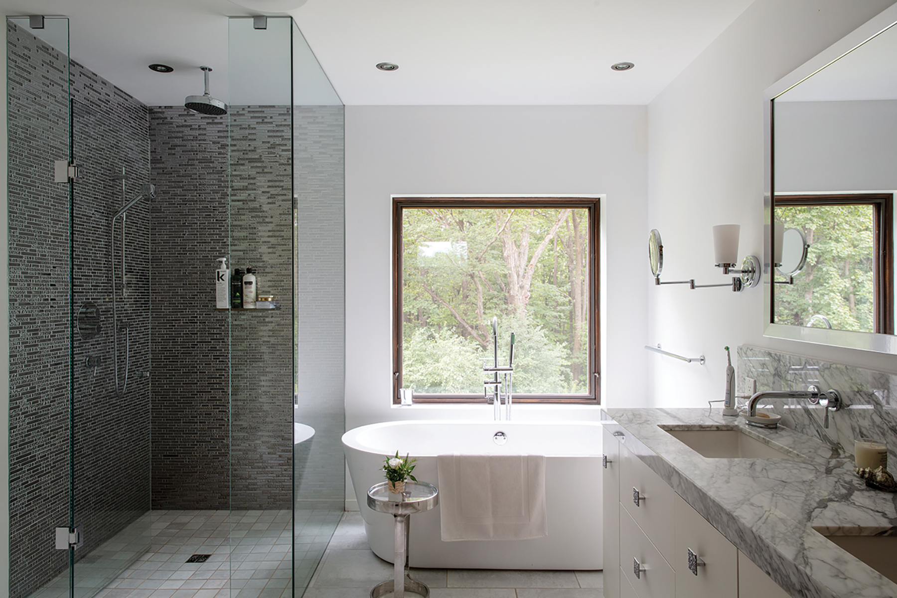
Helen, a former interior designer, worked closely with Campbell to achieve the desired result. “I knew certain things I wanted, and Jim knew how to make them work,” she recalls. “I said I want windows that come down to the ground, I want boarded concrete, I want some glass floors, but I wouldn’t have known how to use those to get the same result.”
She also specified that the house should be no more than 23 feet wide with an open living room, dining room and kitchen in order to allow natural light to travel across the entire space. As a result, the main living areas are so awash with sunlight that artificial lighting usually isn’t needed until late in the day.
The placement of windows and the exterior design of the house not only allow maximum light, but also control heat. “In the summer when the sun is high and strong, the eaves protect the house from getting too hot, and in the winter when it’s cold outside and the sun is low, we get the warmth from the sun, so it’s very energy efficient.”
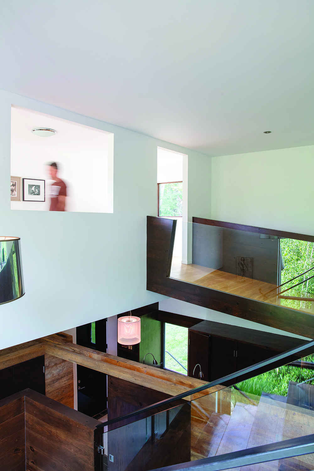
While the main space is very open, the challenge was to create levels of separation in the rest of the house, notes Campbell. “Helen had ideas in terms of form, but our job is usually to deduce out of those ideas what the root is, and in this case it had a lot to do with positive separation between family members so everybody felt at ease and comfortable in the house, not stepping on each other’s toes.”
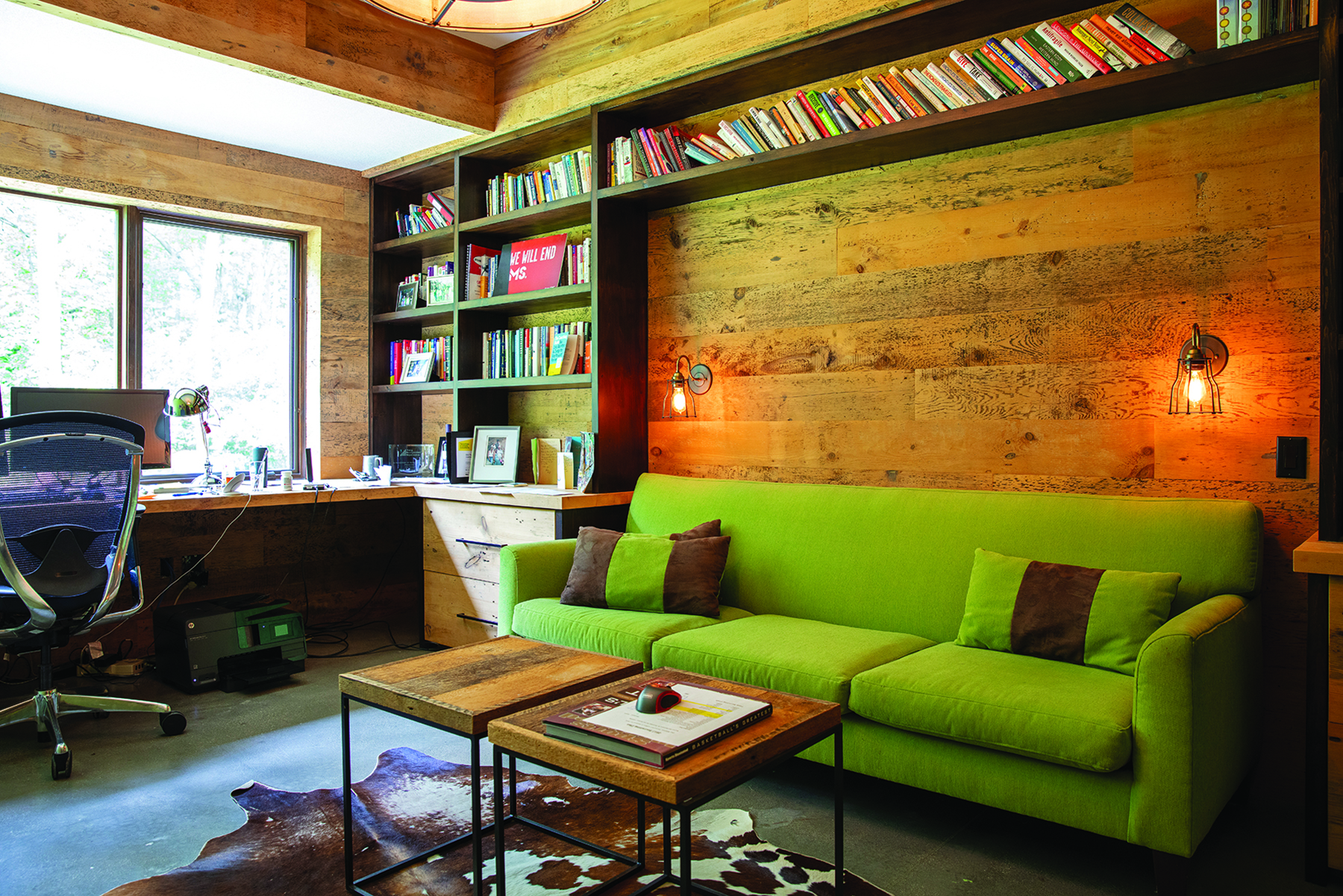
When the house was built in 2010, the Thomsons’ three children were in their teens and the couple worked mainly from home (they still do), so it was important to achieve a level of privacy and sound dampening between the living areas, the two home offices and the bedrooms as well as in the basement entertainment area and home gym.
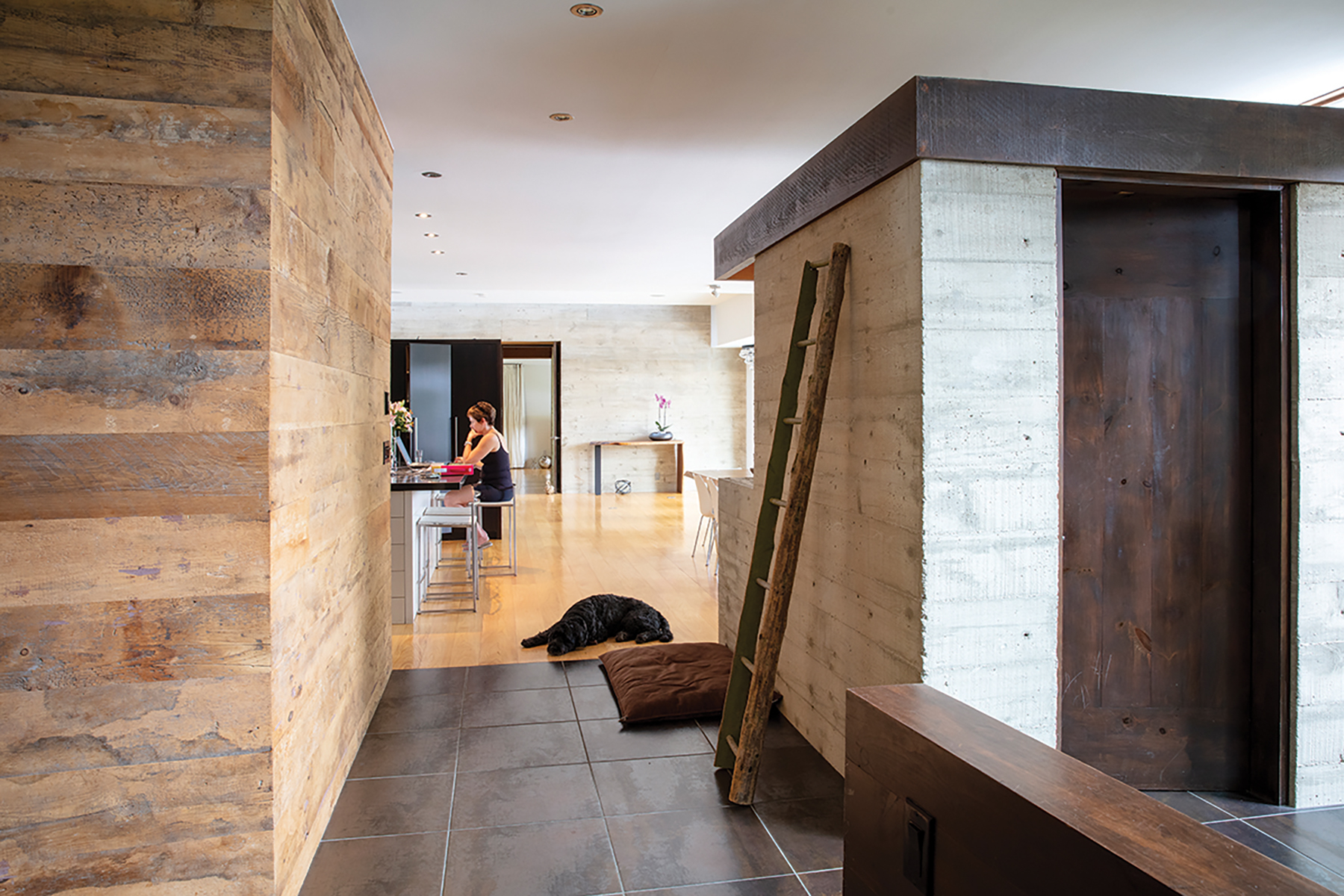
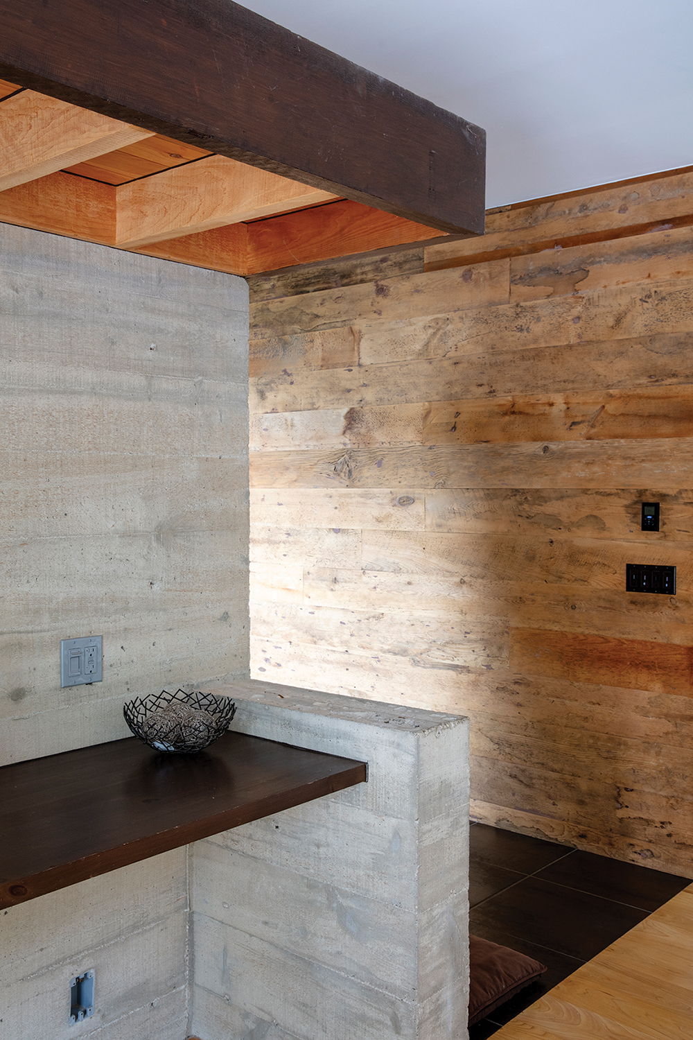
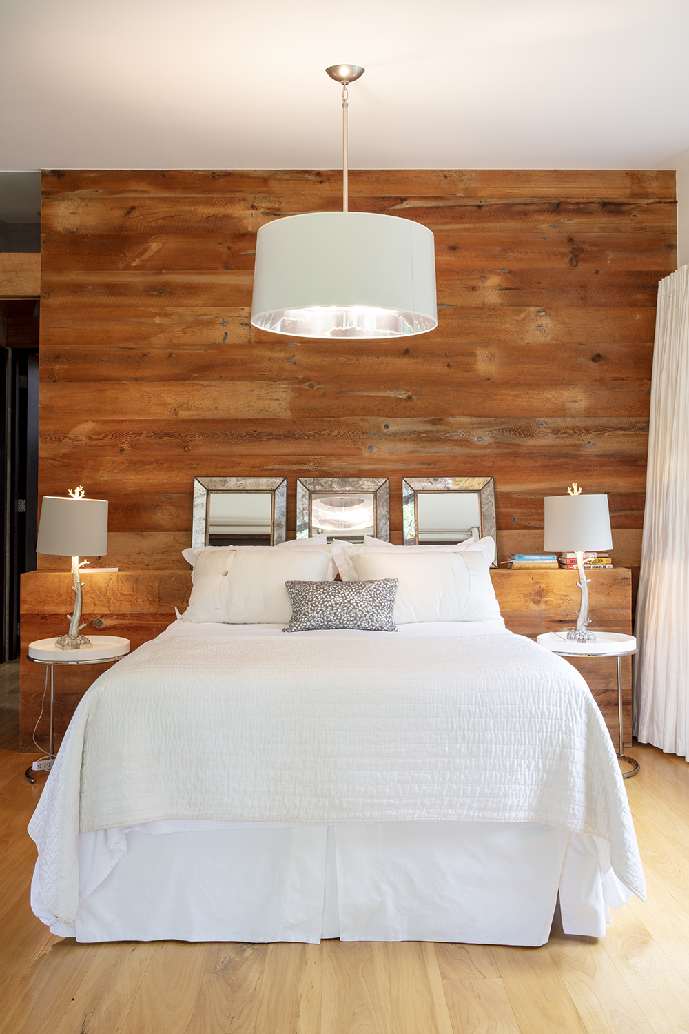
The solution was to use a combination of concrete, antique barn board and dark-stained pine walls for acoustic and physical separation. “We exposed the foundations and extended them with board-formed concrete to get a nice, rustic quality with a material that we’re using anyway in the foundation,” says Campbell. “Thermally, it’s a really good solution in the case of the basement because all of the insulation is outside of the concrete, so we have a nice thermal mass. Durability was also a factor, because the kids were really into sports, so the basement initially had to withstand soccer balls, basketballs and ball hockey.”
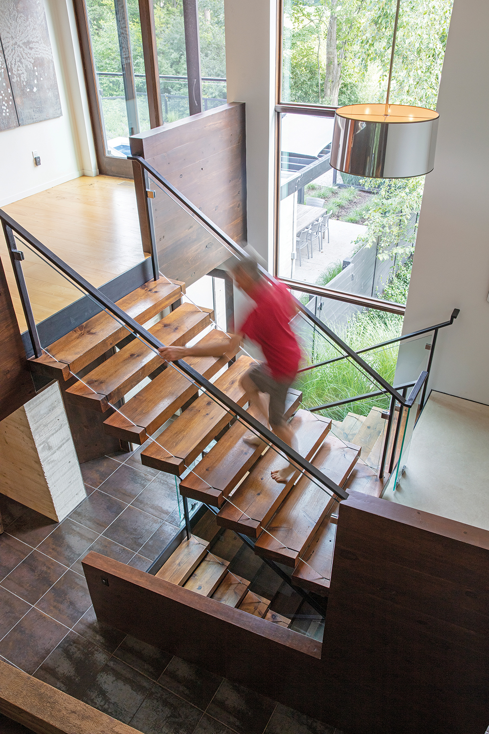
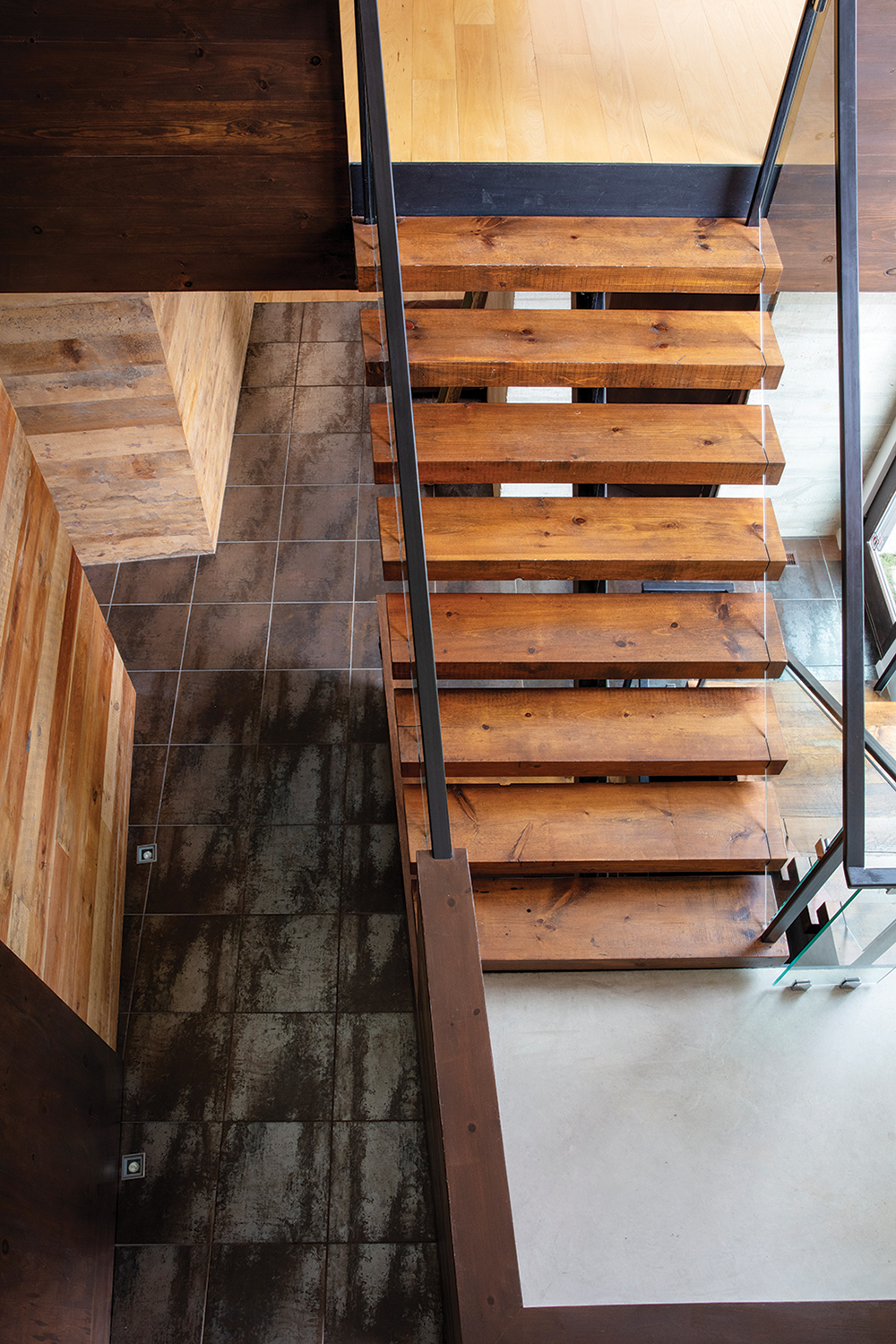
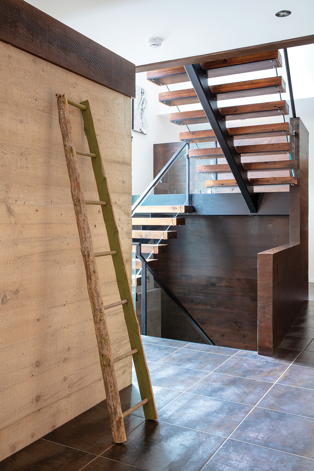
An interior concrete wall extends from the bottom to the top of the house, separating the home gym from the entertainment space downstairs, the master suite from the living area on the first floor, and the bedrooms and office on the second storey.
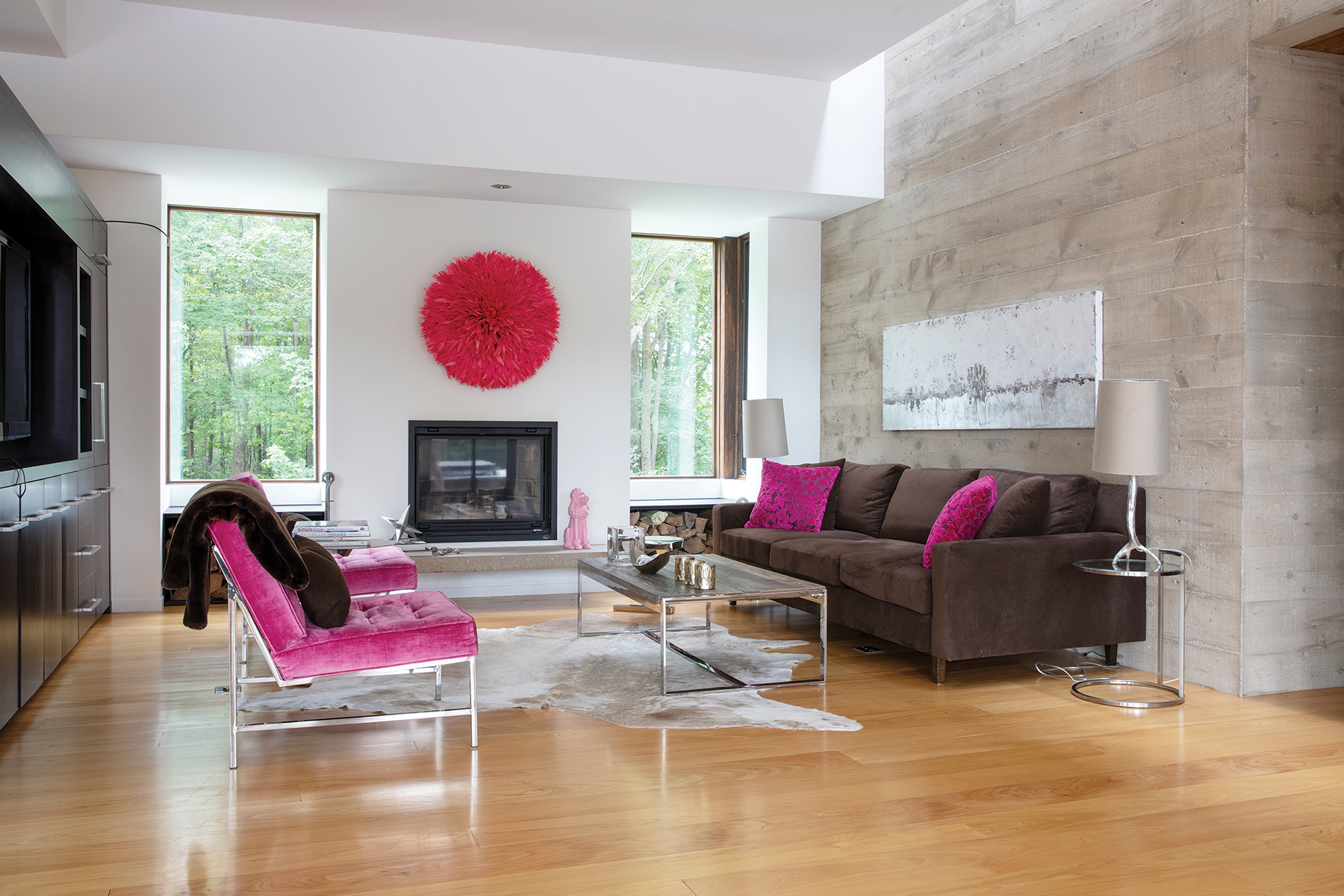
To add interest, the concrete was board-formed, a process in which a wooden form is built on-site to hold the wet concrete in place. As the concrete dries, the finished face takes on the wood grain pattern from the form. This technique visually softens and warms concrete’s somewhat cooler appearance while maintaining its strength and insulating properties.
“It’s a little bit of a reference to the past, because with early use of concrete, that’s how it was formed originally,” says Campbell.
This interior concrete wall also includes a hidden but crucial detail – a long, narrow glass ‘window’ tucked up in front of the wall to filter light through from the windows on the second floor. This also helps warm and soften the look of the concrete.
“If you hit concrete with a lot of sunlight it doesn’t have the same effect as if you can wash the wall with light vertically,” explains Campbell. “If you pour the light in from the top, you’ll emphasize the texture of the concrete, picking up the light and shadows. It’s fun because you don’t know where the light is coming from until you’re right next to the wall.”
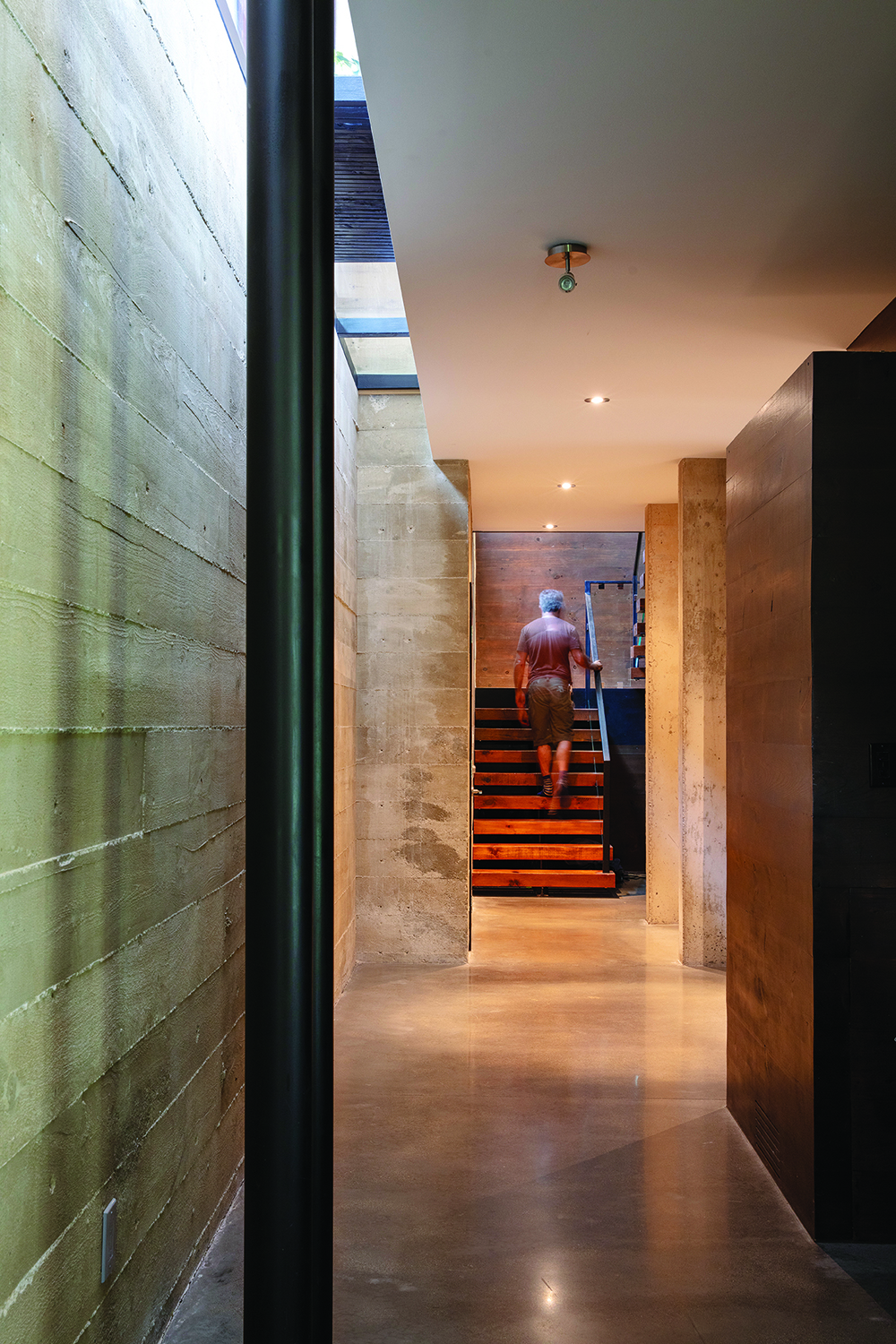
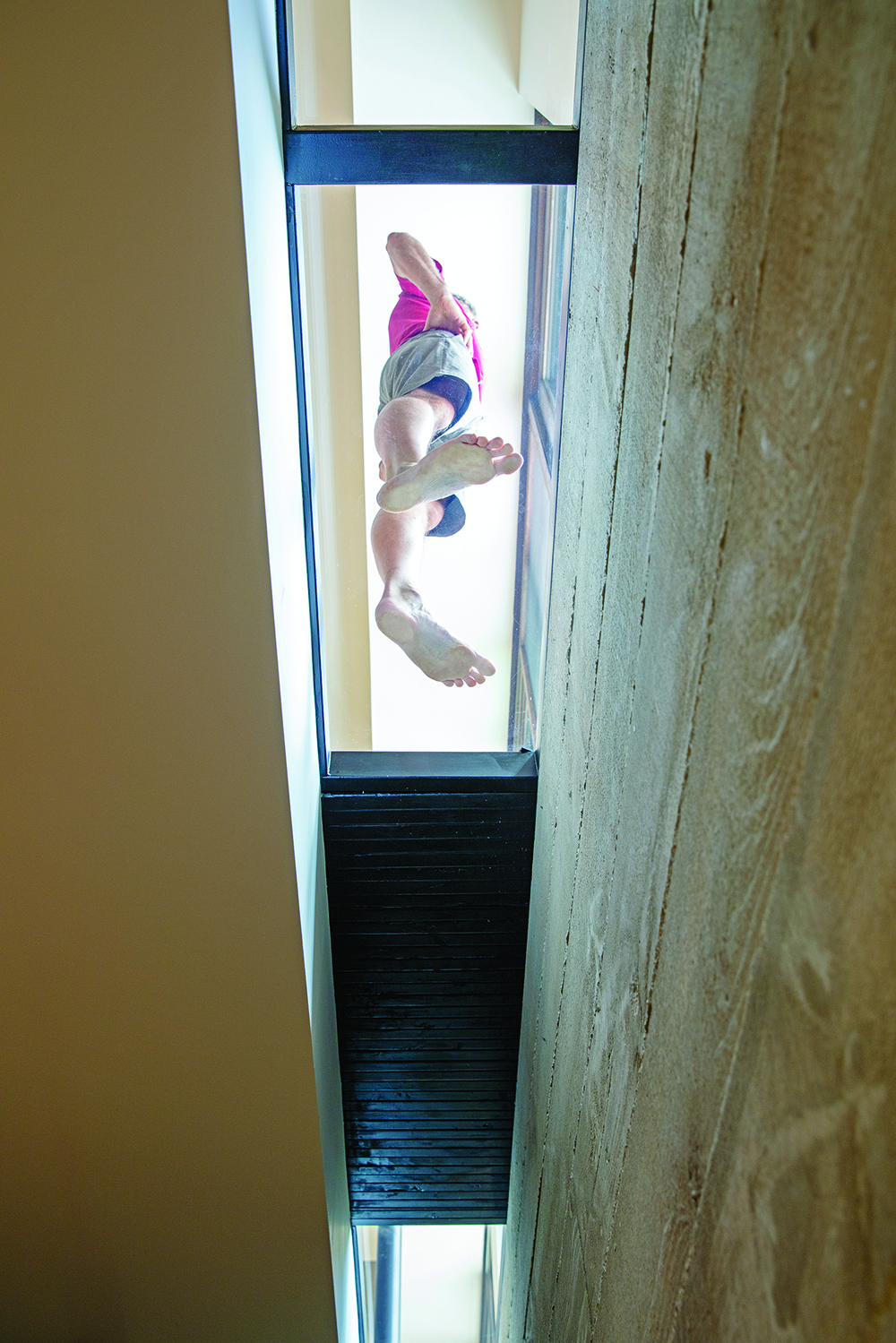
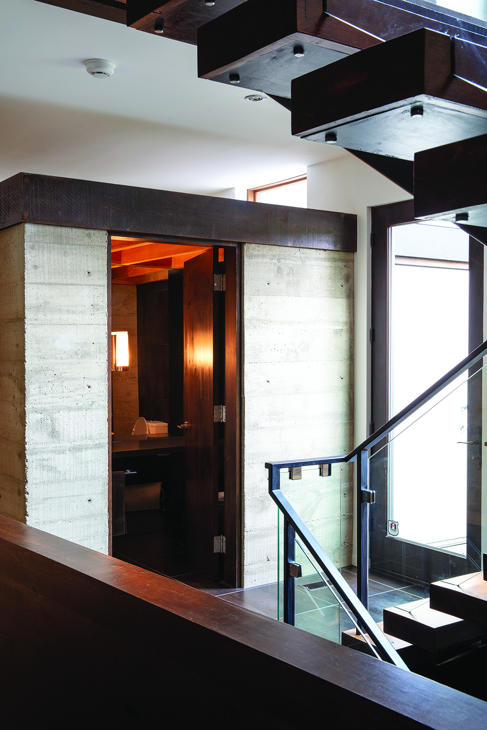
This use of borrowed light – natural light that enters an otherwise dark area from an adjoining space through windows or skylights – is a signature of Campbell’s design sensibility. Another particularly creative example in the Thomson house is a strip of glass floor spanning the length of the main living space along one wall, which draws the light through to the lower floor.
There are some structural challenges to using glass in a load-bearing area, so in both cases Campbell turned to Dan Barill of Barill Engineering in Collingwood to make sure the glass could support the floor above.
With some interior walls at a slight angle and light filtering in from above, the overall effect gathers inspiration from exploring the caves and crevices of the Niagara Escarpment upon which the home is perched, something Campbell has returned to with subsequent projects. “This was the first project where we were really exploring the whole idea of emulating the Escarpment structure in terms of crevices and creating Escarpment-like spaces,” he says.
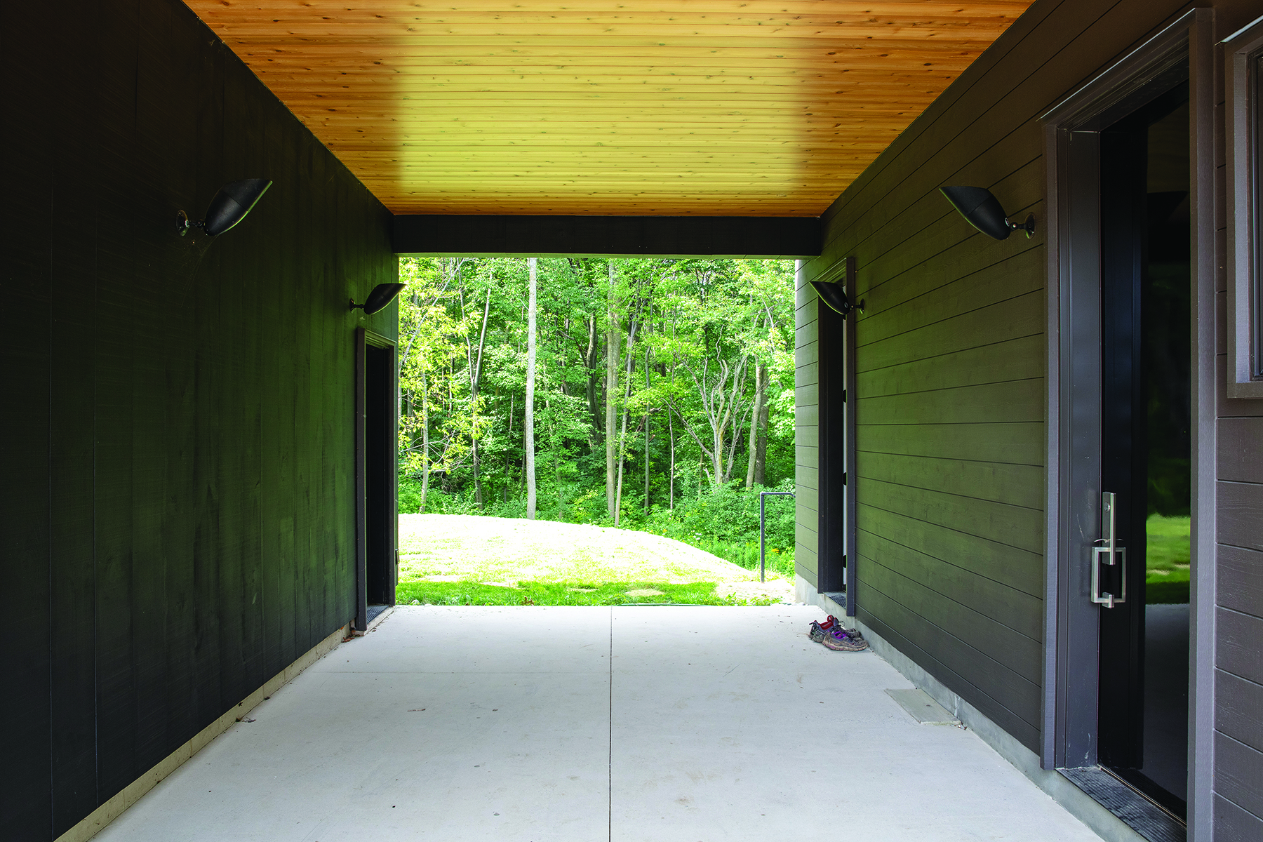
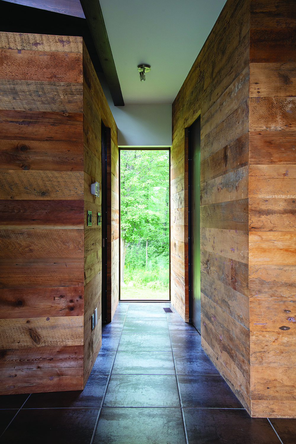
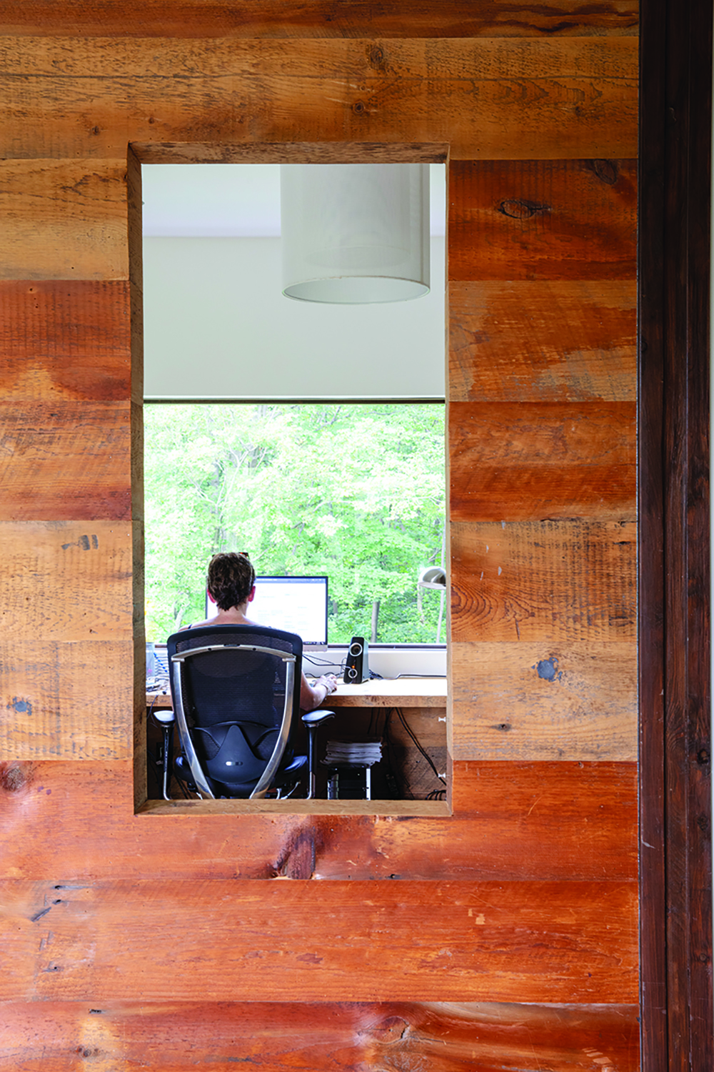
In order for the interior to adequately reflect the Escarpment, the siting of the home on its 35-acre lot also had to be just right. “We wanted to position the building so you have your feet in both worlds,” he says. “The one view is a very pastoral/agricultural aspect that is very Southern Ontario and the other view is more tied directly to this area with the ruggedness of the land and the trees. It’s straddling the border between the agricultural and the natural world. It’s an awesome place to be because you can pick your view depending on your mood, the cosiness of the forest or the expansiveness of the land. It gives you the option to connect with the exterior in two very different ways.”
In the 10 years since the house was built, the Thomson family has grown and changed along with the landscape, and their beloved home continues to be a source of comfort and inspiration. “With a water view, things don’t really change very much, and I really like that this changes,” says Helen. “The trees are constantly changing. The summer is completely different than the winter; the fall and spring are beautiful. And if I don’t feel like looking at trees, all I have to do is turn around.” ❧
To see more of photographer Lorne Bridgman’s work, visit lornebridgman.com


