Quick and easy changes to transform a room
stories by Judy Ross, photography by Derek Trask
Tired of staring at your four walls? Wish you had something different to look at during these long, cooped-up days of the pandemic? Wondering how to make changes at home without spending a fortune? On The Bay consulted an expert in changing the look of a room to show us how it works.
Suze McCart is an interior decorator and home stager who has been refreshing spaces for homeowners and realtors for 14 years. We gave her the challenge of taking a basic living room and updating it with three distinct decorating styles. Here’s what she did and how.
The Starting Point
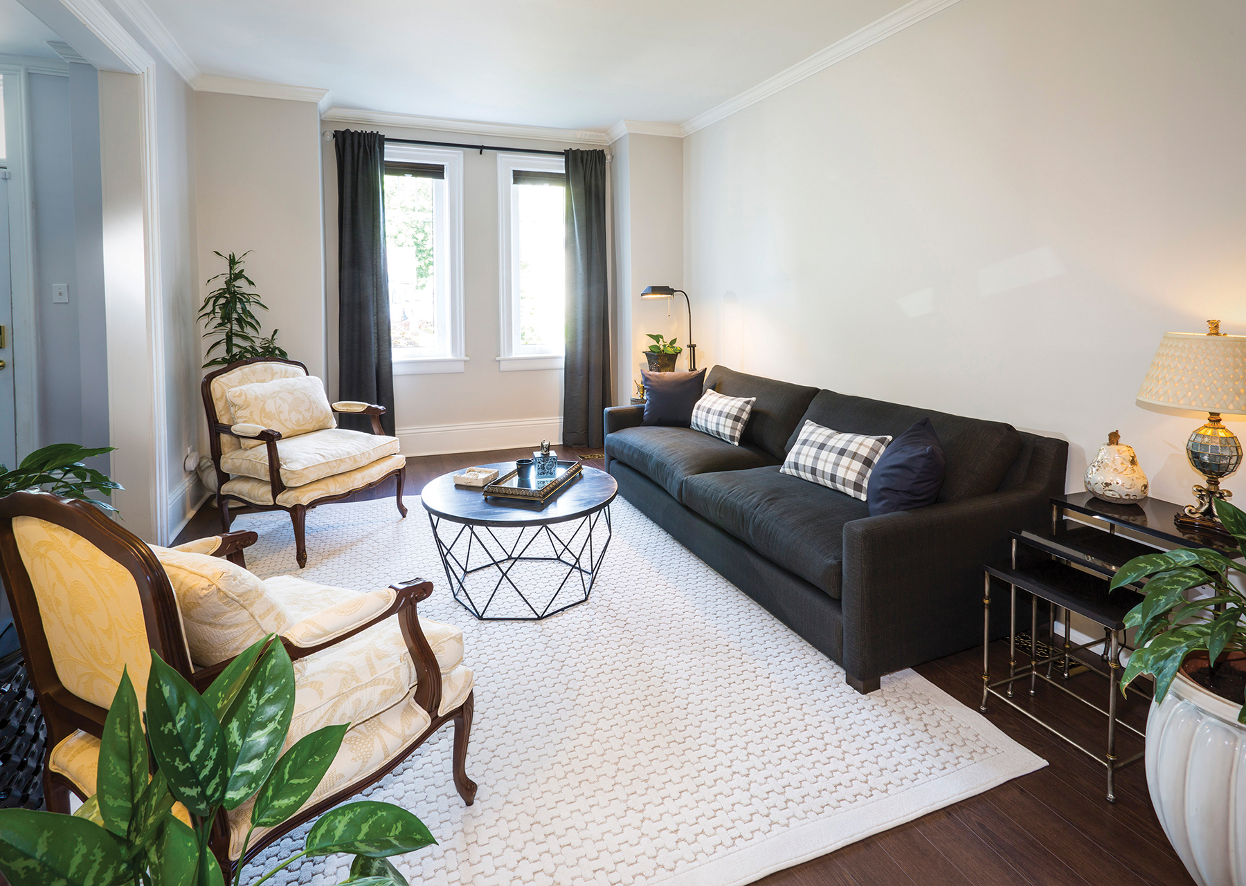
The original living room in this house needed some editing, so McCart began by taking away some of the knick-knacks and allowing the room to breathe. She was then able to see what changes she could bring to the space. The only items that stayed in place throughout all the scene changes were the sofa, coffee table and area rug. Lamps, plants and accent pieces were rotated in and out.
“One of the best ways I find when designing a whole house or just refreshing a room is to first look around the house; often there are pieces of furniture, lamps and art that can be recycled,” says McCart. “Sometimes we’ve had something in the basement or tucked away in a cupboard for so long we don’t even know it’s there. Items like chairs, lamps and rugs can be moved easily from room to room and it’s amazing how different they can look in a new setting.”
In this case the living room is small and somewhat narrow with windows on one wall and two wide door openings, one to the foyer and one to the dining room. The house was built in 1904 and the main floor layout is typical of older homes in downtown neighbourhoods. The homeowner had good quality basics: a large dark grey sofa, an ivory patterned rug, a stylish wood and metal coffee table, and two Bergère armchairs that were purchased 25 years ago. She wanted art and some accent colour, but didn’t know what direction to take or which colour to choose.
As McCart explains, “Art is a good starting point for a room, but it can be difficult. We don’t know what to get and are often afraid of making a big investment in original art. But inexpensive options are available. Every piece of art that I chose for these rooms is a print on canvas, bought at home stores like HomeSense. They’re a good size, they don’t cost much, they aren’t heavy and they’re easy to hang. Of course, real art is wonderful in any room, but sometimes it’s beyond the budget.”
Choosing a theme for every new look gave McCart a focus and allowed her to play with colour, pattern and texture. In each of the three rooms the art came first. “It’s important to choose and to hang art properly, and to pay attention to scale and proportion,” she notes. “The two biggest mistakes are hanging art too high up the wall or choosing pieces that aren’t the appropriate size for the space.”
Once the art was chosen, the fun could begin. The three looks are all unique and show how a little imagination and a selection of just a few new things can give you a totally different look.
The Boho Look
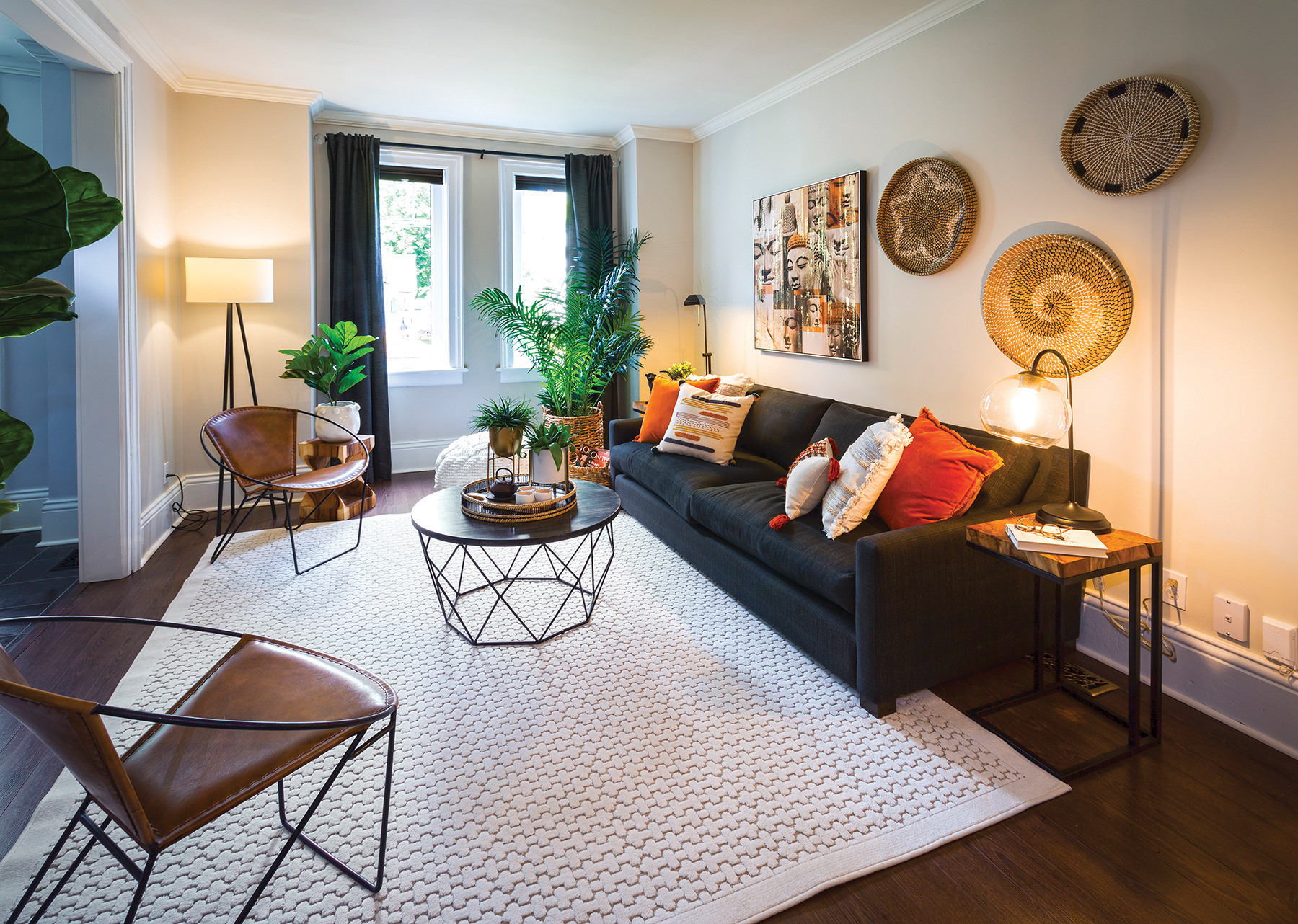
This look derives from the word “Bohemian,” suggesting an eclectic – often exotic – gathering of items and a carefree, relaxed style. The opposite of minimal or neutral, the boho look involves layering of textures and saturated colours, along with plenty of greenery.
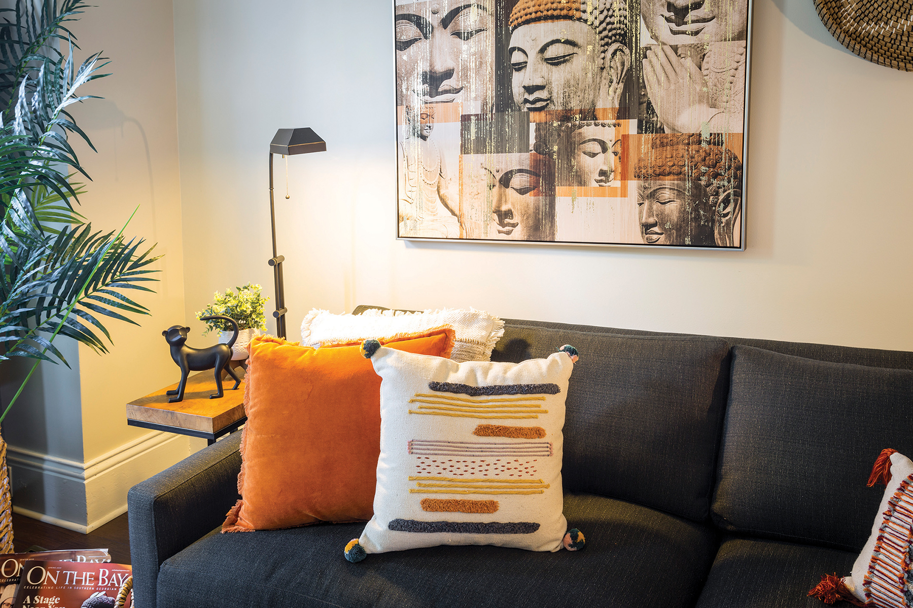
“In this room, I used the Buddha print as a starting point for the colour palette,” explains McCart, “then I found the perfect pillows for the sofa.” The print was hung off-centre, allowing for a trio of baskets to complete the casual look of the wall arrangement. Two leather hoop chairs were brought into the room to replace the original, more formal armchairs. A nubbly pouffe is a nice textured addition, and can be moved about the room and used as either seating for kids or as a footstool.
McCart used the subtle orange tones in the Buddha print as the basic accent colour. “If you’re introducing colour in a room, a basic rule is to use it three times,” she says. “Here we have the orange tint of the leather chairs, the art and the sofa pillows. And since the boho look allows for lots of character, we added some funky sculptural pieces.”

“If you’re introducing colour in a room, a basic rule is to use it three times,” she says. “Here we have the orange tint of the leather chairs, the art and the sofa pillows. And since the boho look allows for lots of character, we added some funky sculptural pieces.”
The Rustic Chalet Look
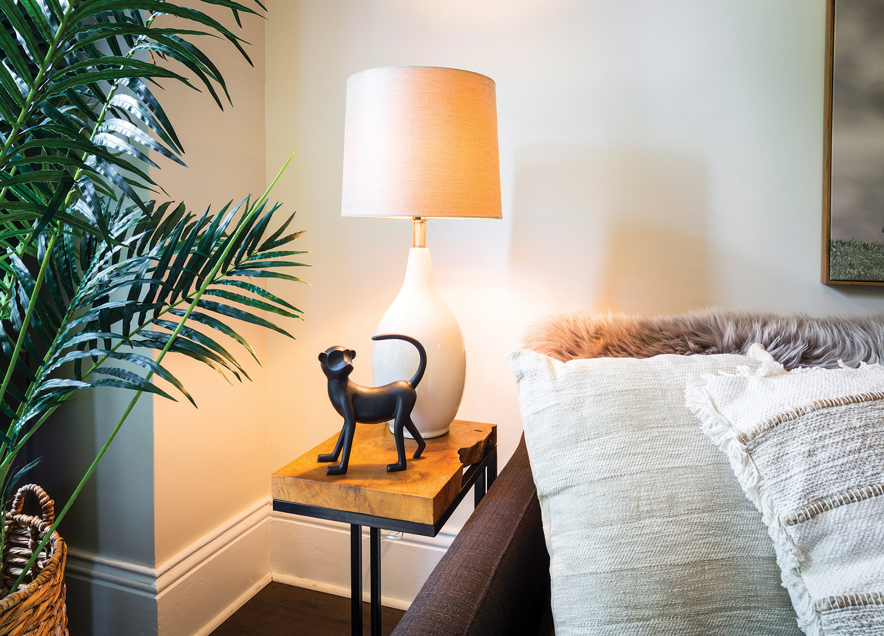
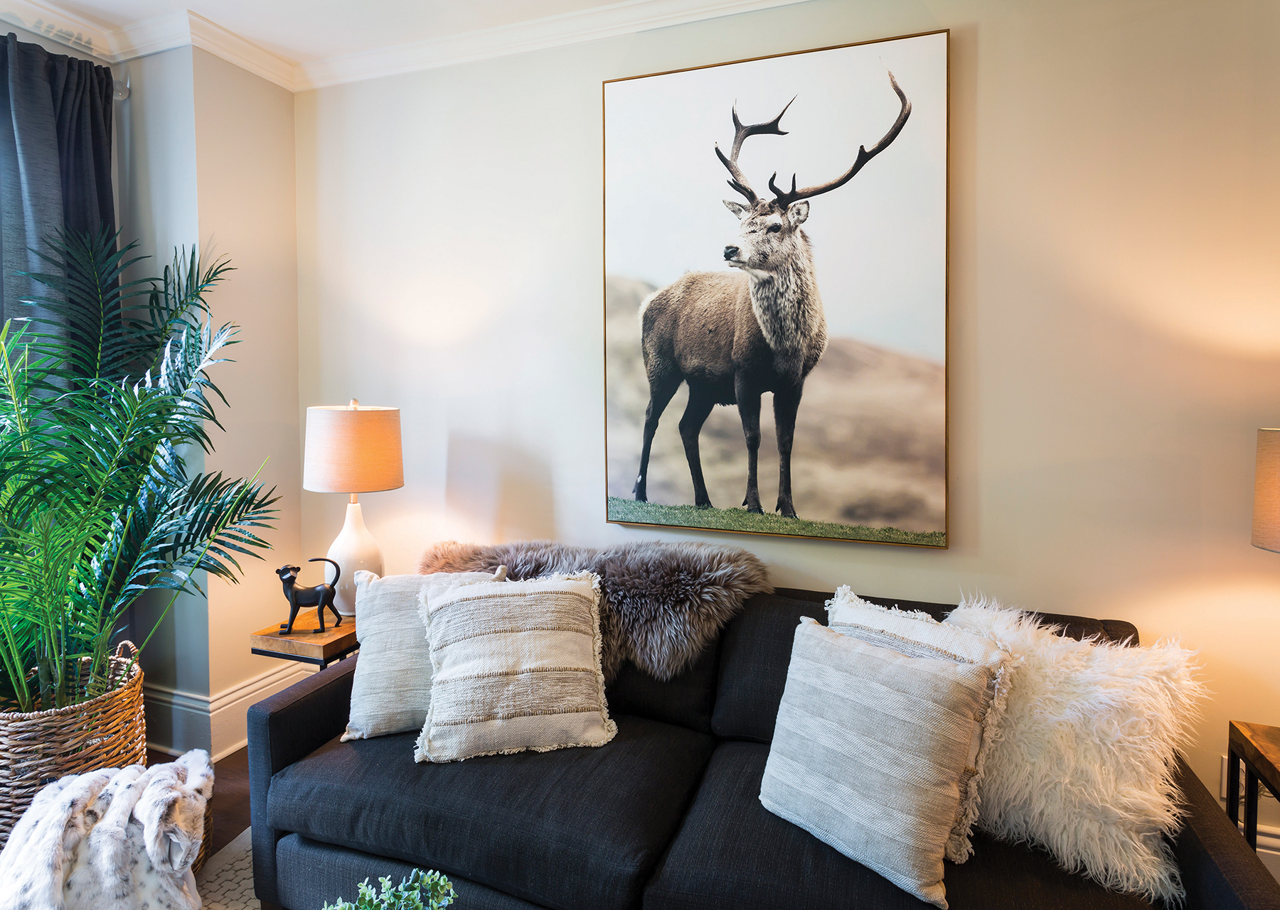
“In this room you just want to touch everything!” laughs McCart as she tucks a sheepskin throw into the corner of the sofa. This versatile design style is more commonly associated with log homes and ski chalets, but here it adds an exuberant new look to the living room of a downtown Collingwood heritage home.
The oversized photograph of an elk provides the dramatic starting point. Normally, art hung over a sofa should take up about two-thirds of the horizontal space. But this print is tall enough to compensate for the narrower width. Everything in the room is nature-inspired, with earthy colours and real animal skins. The cowhide was layered on top of the rug to anchor the space, and McCart used the same plants that were in the boho room.
New tweedy armchairs were brought in that are “really comfortable for reading,” and plenty of throws and cushions add to the all-important warmth and comfort of the rustic chalet look. “It’s important to get the scale of the throw pillows right,” says McCart. “Too often you see sofas with dinky pillows.
Here we layered many of them, all with different textures, but all of them feel great when you touch them.”
Although the live-edge side tables stayed the same for this look, new neutral ceramic lamps were added to suit the soft, warm colours and natural textures.
The Sophisticated Contemporary Look
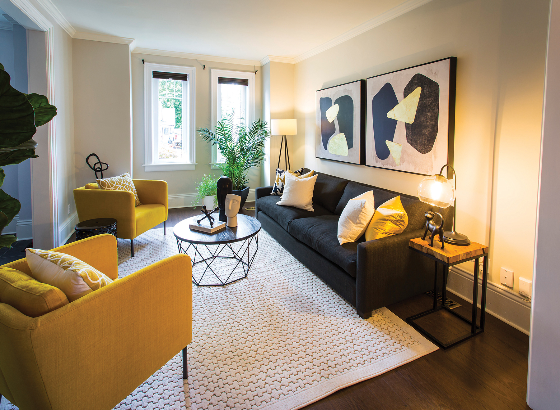
Contemporary differs from modern in that it showcases space rather than things. ‘Less is more’ is the mantra for this style. To achieve this the drapes were taken down, which brought in more light and revealed the interesting architectural details of the window trim.
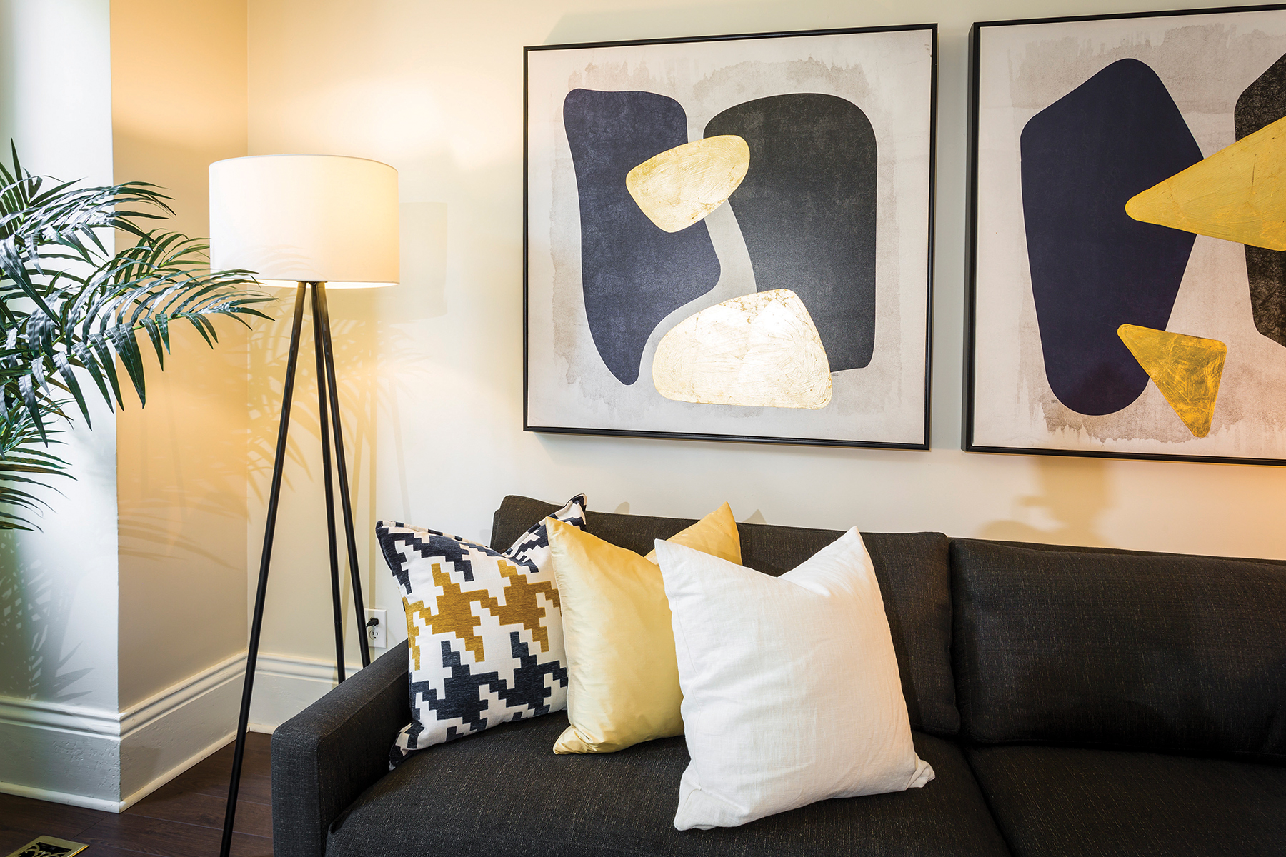
A pair of bold abstract prints over the sofa add graphic punch to the sophisticated palette of black, gold and cream. Clean lines and metallic elements form part of this look. The two mustard coloured armchairs energize the room and tie in with the gold in the artwork and throw pillows.
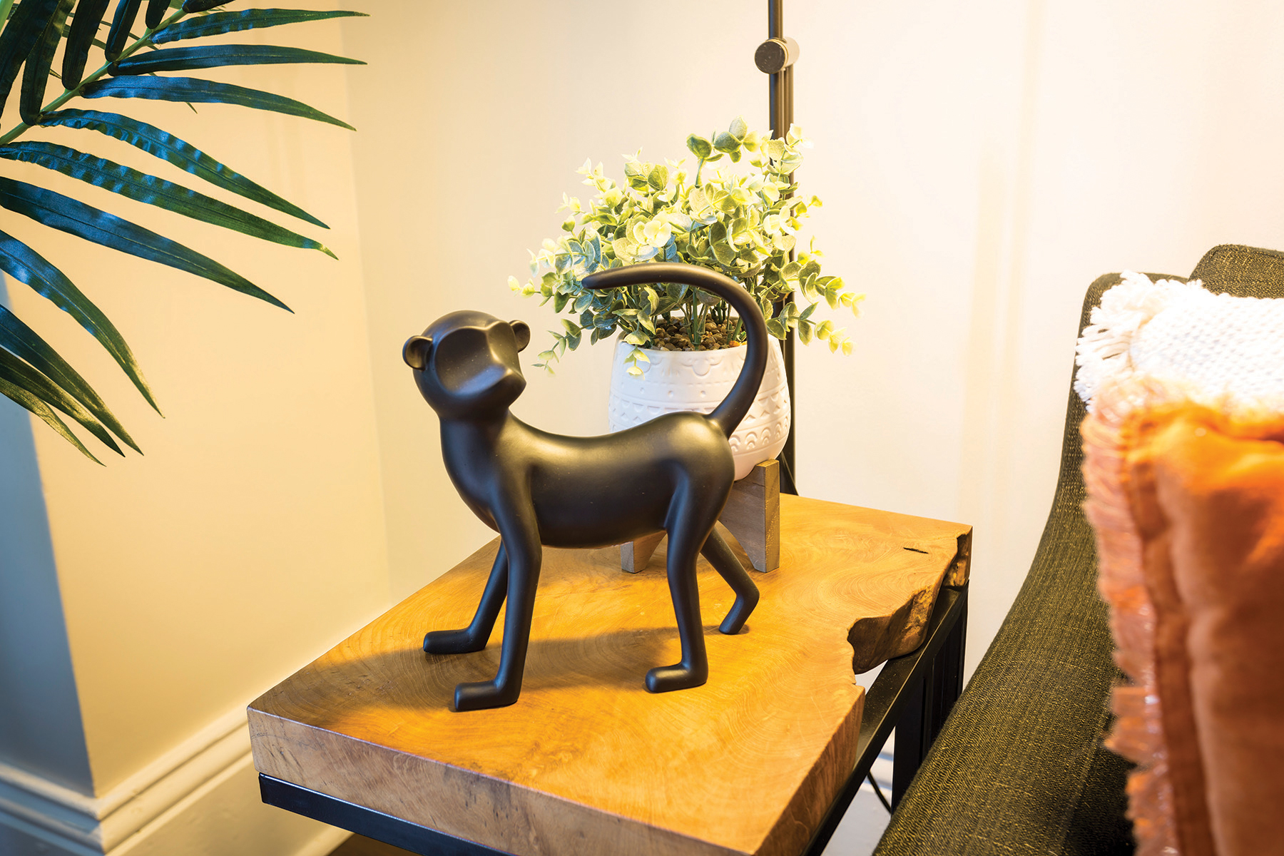
“I always use some black in rooms that I design,” says McCart. “It grounds a space and adds a sophisticated look.” Here, black is seen in the metal lamps, the plant pot, the ceramic head sculptures on the coffee table, and the black resin monkey – “Gus” – who appears somewhere in every one of these different rooms. “I always like to add some whimsy,” laughs McCart, “and Gus is here for that!”
Accessorize Like a Pro
A good way to start the process of breathing new life into your space is to clear it out. Remove all small and mid-size items such as art, pillows, lamps and knick-knacks. Once you’ve done this you can see the room more clearly and assess what is needed and what to keep.
“Don’t keep it if you don’t love it,” advises Suze McCart. “People get attached to things for sentimental reasons, but sometimes you have to let it go.” Injecting your own personality keeps a room from looking like a staged model home. No matter what style you hope to achieve, the best-looking rooms involve a combination of old and new. You want the room to seem collected over time. If you have treasured heirlooms or antiques that you haven’t looked at in years, bring them all out, dust them off and examine them. Be selective and place them appropriately to make your space original.
Books are essential and always add character to a room. Arrange them vertically and horizontally on shelves. A stack of coffee table books can be used as a pedestal for an interesting vase or bowl.
When arranging accessories, pay attention to scale and proportion. Groupings of three or five generally look best. Think of a triangle when arranging a grouping using one tall piece and two lower items. Use trays to group items on tabletops. Arrange sofa pillows the same way by choosing different sizes and layers of texture and pattern.
As a final word of advice: “Don’t do what’s trendy. Do your own style but keep it timeless and classic.”


