A new micro-hotel in Collingwood encapsulates the shift to maximalism, playfulness, and colour.
by Anya Shor // Photography by Anya Shor
Until recently, “hotel-inspired” design evoked images of neutral palettes, white waffle bathrobes, white high-thread-count linens, polished concrete, and understated lighting. It was sometime in the ‘90s, at the height of American fashion-driven minimalism—when Wallpaper* magazine was the go-to architectural and interior design manual—that hotels were at the forefront of innovative, cool, trend-setting design.
They became smaller, lighter, smoother, chic and sleek “boutique”—with DJ-curated CD soundtracks to match—and often the destination in and of themselves. And suddenly everyone wanted to bring a piece of that impossibly cool, pared-down aesthetic home.
But good minimalism can be hard and expensive. Successful execution requires restraint and the kind of costly craftsmanship that conspicuously exposes walls, baseboards, and corners to reveal perfect lines and angles, expensive hardware, and high-end materials. Executed poorly, it can leave a space feeling cold and lonely.
Maybe our eyes got hungry, maybe the growing uncertainty of global events—economic insecurity, environmental urgency, pandemic-driven isolationism—got us yearning for colour, texture, and warmth. Now we yearn to revive a sense of playfulness and nostalgia. “Upcycling” is the key word. Facebook Marketplace is our new favourite store. Maximalism is in and we’re here for it, and hotels are once again leading this aesthetic shift.
One such jewelry box of a boutique hotel is the newly opened 11 Rooms in downtown historic Collingwood. It features 10 work-friendly hotel rooms and a comfortable communal space in a stately brick Victorian house on St. Paul Street. From the first step into the vestibule, one notices the whimsical knobs on the mailboxes and the spring green palette of the walls. Another step through the blue doorway is the start of an unrelenting visual feast that is exhilarating and delightful.

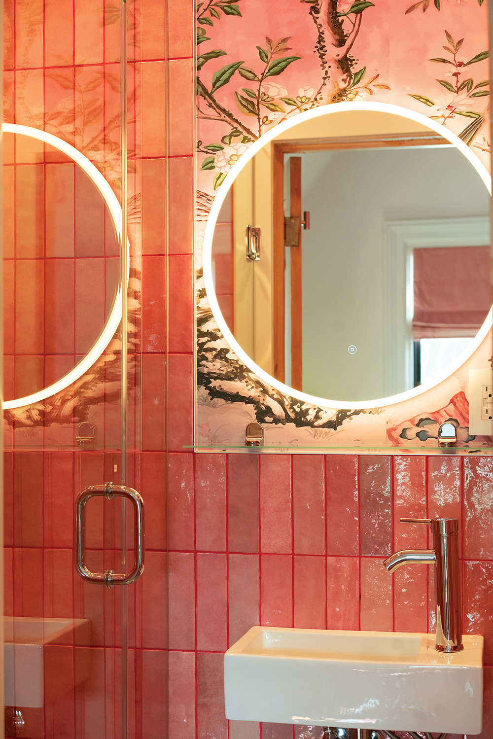
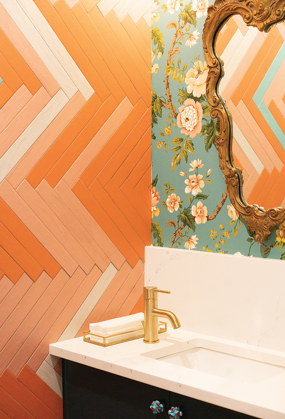
We did things that most people won’t do at home—like the pink tile and red grout in Room 8.
At first it’s hard to decide what to set eyes on; is it the robin’s egg blue walls, the surprising emerald green staircase, the pastel herringbone floors, or the dainty chandelier twinkling overhead?
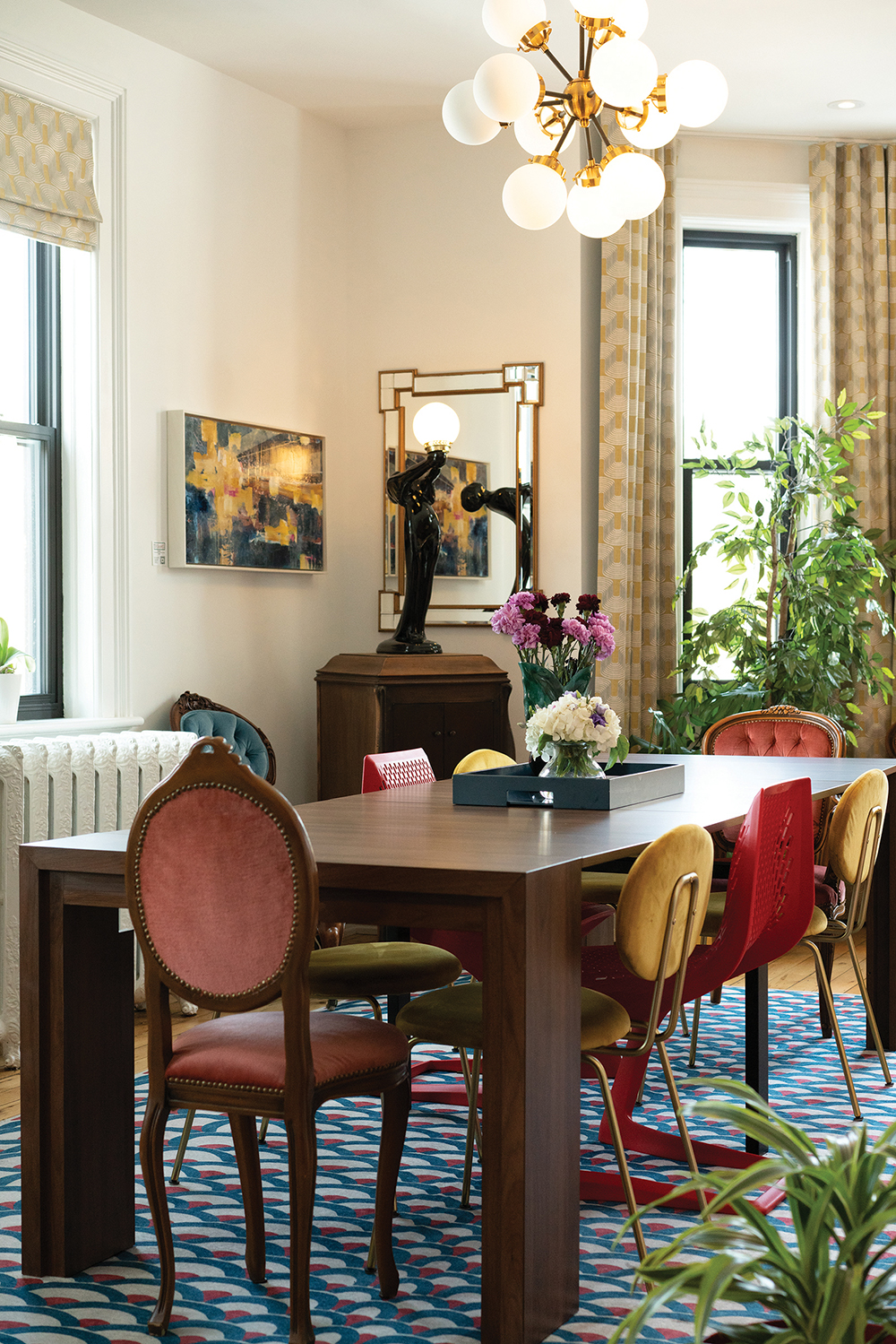
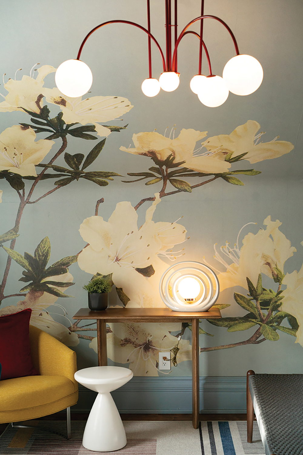
That quickly proves a futile task as soon as you turn the corner into the communal lounge, a room anchored by an ornate original wood-panelled bookcase and mantle set against a striking scarlet wall and filled with an artful collection of tea pots and books. All this is surrounded by an eclectic mix of modern designer chairs, patterned curtains and rugs, mid-century light fixtures, art deco statuettes, Victorian settees, and oh-so-much more!
11 Rooms is like a sumptuous buffet. At first glance it’s overwhelming in its bounty, designed to be enjoyed in incremental and frequent returns. “People often comment on how intentional everything seems at 11 Rooms. We’ve put care and consideration into every detail,” said co-founder Sandra Kahale.
That consideration is the key to successful maximalism. When bringing together so many elements at once, it’s deliberation, not restraint, that determines the point when enough is enough. Curated clutter is charming, but without an unintended flea market effect.
The overall vision was Kahale’s, and partner Amy Bond was the chief tastemaker. “The two of us worked together most consistently, pulling the threads to ensure coherence in the context of eclecticism. We gave ourselves permission to go a little crazy with colour and design,” said Kahale.
“People often gravitate toward neutrals when they decorate their homes. We wanted to create an alternative—a bold environment that’s totally out of the ordinary, but also gets people thinking about how they might bring touches of colour and whimsy into their own every day. We did things that most people won’t do at home—like the pink tile and red grout in Room 8.”
Many artists and talents were engaged in the creation of 11 Rooms, which Kahale describes as “a very organic, very collaborative process, over many months, involving the four partners who own the hotel and some key collaborators, including our friend Jeff Wilbee, who owns iDekor (an online furniture and accessories store), and local designer Jassy Sidhu, who took the lead on our common areas as well as on window coverings and overall paint colours.”
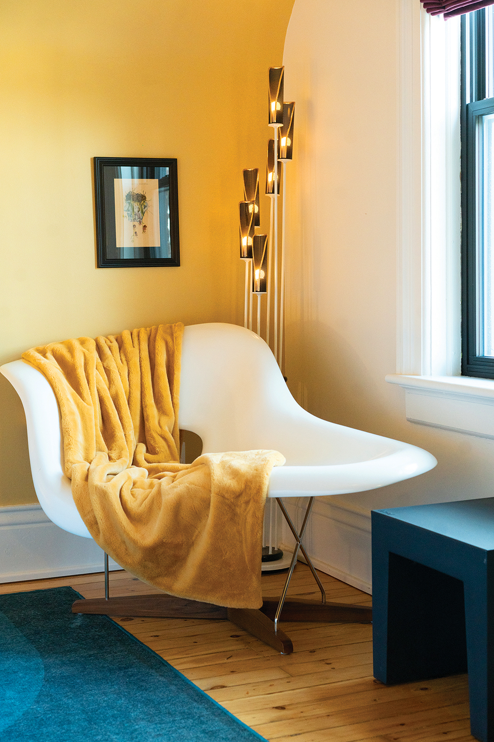
Jeff Wilbee kicked off the room decor, creating an initial plan that identified the must-haves for each space, and sourcing key pieces from iDekor, as well as vintage finds. Among other things, he found the striking white polyurethane reproduction of the iconic Eames “La Chaise” chair in the corner of Room 7 on Marketplace!
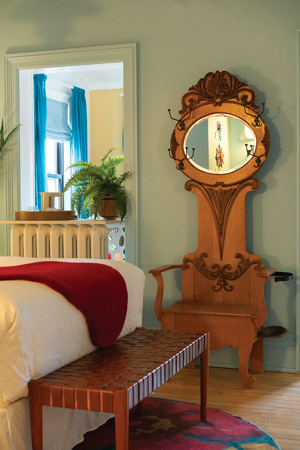
“The hall tree in Room 4, which has hidden storage in the seat, came from the Aberfoyle Antique Market, and was a controversial purchase—half the team loved it, the other half loathed it. Happily, everyone agrees it’s perfect in this room,” says Kahale.
When asked to identify favourite features or elements in the hotel, Kahale replied, “It’s hard to isolate…. What we love is how everything came together from seemingly disparate, incongruous parts to create a complete experience for the senses. There’s so much to see and touch and feel. For us, it’s all about how those elements work together.”
So dust off your grandmother’s beloved fringe-trimmed lamps, buy that mid-century console you’ve been eyeing on Marketplace, and embrace your love of sherbet-hued paint and whimsical wallpaper. Then you can put on your velvet robe and fuzzy slippers and imagine yourself living in some fabulously sumptuous boutique hotel in London, Paris or…Collingwood!


